Friday, 30 September 2016

Location Research-

When planning our trailer we decided to use locations which would appeal to children and lure them in. This includes parks, green areas, ponds and train stations. These would be ideal for a clown to hide and capture it's victims. We thought about using the pond in Ashtead, displayed in image one. For dramatic effect we thought we could get the clowns reflection in the water and through the ripples. This would create a tense atmosphere and hopefully leave the audience feeling on edge. We also want to capture this at night, to get the dark and eerie       lighting which conforms to the horror genre. As a trailer captures moments throughout the film, including different days times and locations we need to decide what time of the day we would like to include the pond. I feel it would be best to use the night as it would give a more freaky effect, however, when filming we may have to use the daytime so the reflection in the water is visible. This is something we will have to trial and error in order to get the most successful outcome. A extreme long shot of the pond would also work well showing the clown in the corner holding the balloons. It will not stand out hugely making the audience think "Did I see something?", this will hopefully keep audiences captivated in out trailer.
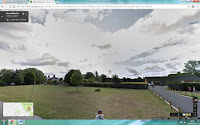

The second image shows the green field area at Ashtead park. A park will work well when producing our trailer as its a common area to find children playing and having fun. We want our trailer to look as real as possible so the audience can relate to it. We hope to capture the clown lurking in the bushes, then suddenly appear making the audience jump with fright and suspense. A dramatic sound effect will work well when creating tension and making the overall trailer more successful. Whether the sound effect is screams, whistling winds, footsteps or a general drop in music, I believe it will give viewers something to be suspicious over and carry on watching. The main target for a horror is to frighten the viewers, I feel this will do just the job! We could use this location more than once to show the clown attacking its victims in which it finds in the park.

Furthermore, we have a park located in Fetcham. There is a dark woodland behind the park which we thought would be effective conforming to the horror genre and making the atmosphere more taut. There are also basketball courts which we could use when locking the victims in with the clown. Sound effects included would be screams showing the victims vulnerability and distress. Ambient sound at this point would include whistling winds and padlocks which show they are locked in. We would also do the filming at night to have dark, ghostly and sinister lighting. 


Our last location idea at this point is a train station. We feel a really successful shot would be a long shot showing the clown standing on the platform with many balloons and suddenly a train passes super quickly. The next shot would be the platform, but empty. The clown would be gone and the audience would be positioned to feel endangered and unsafe. We want to find a level crossing where it will look more abandoned and quiet compared to a busy train station where people in the background can affect the realness and continuity in filming. We will also include sound effects of train horns and spinning wheels, this will make it appear more realistic and exciting for viewers. We would take this shot during daylight as we want to show how the clown appears at ordinary places and ordinary times in the day. 

Thursday, 29 September 2016

Back To The Start!

Seeing as we've decided to base our trailer around the horror genre, myself, Nadiye, Katy and Chloe all sat down to plan what we wanted to get out of our trailer and the ideas in which we had. We grabbed numerous A3 pieces of paper to jot down our ideas including plot, characters, costume and sounds. After chatting, agreeing and disagreeing we thought about a horror trailer including a frightening clown. Clowns can have two different appearances, happy/funny or horrifically terrifying. In my opinion clowns are always daunting! After coming up with the main subject of our film we began to think about characters and costumes. Katy, we thought best suited the clown character. We will find a creepy clown outfit which she can wear during filming. This will include a full jumpsuit and mask. We want the outfit to come across as fearsome and spine-chilling. We googles 'Scary clown costumes' and got inspiration for the types of colours and patterns needed to give the effect we want. The colours red and black work well when demonstrating death and violence thus giving the effect of something horror like and unnatural. We want the clown to look fairly human like meaning its 'Possessed', this may mean we don't use a mask just use some of Nadiye's impressive makeup skills! We all decided as Nadiye should be the victim as she would best suit the part. We thought along the lines of her getting bullied and conjuring up the clown to attack the bullies. However, when thinking about it we think this may be tricky to act, suggesting Nadiye should be unaware about the clown until she comes face to face with it. Costume ideas consists of fairly bright colours not making her look evil or deathly. Finally, for myself and Chloe we decided we should be the bullies who get their comeuppance. Our costumes include dark tones which help reflect death, sorrow and violence. When thinking about the title for our trailer, we managed to decide what we wanted fairly quickly. We went with "Jokes on you" as we feel it connects with the subject of the film perfectly and gives a freaky twist on something that would usually be considered funny. To make it appear a little more creative we have replaced the "O" with a shiny red ballon. This connotes what clowns use to lure in children as well as the shine linking to their red noses. The title is effective as the two bullies finally get their comeuppance hence why the title is "Jokes on you". We all feel the balloon is hugely effective and wouldn't want to over use it as it may take away effect using it on the 'on' and 'you'. Some locations we thought would work effectively are, parks, train stations, houses and woodlands. The parks are ideal places for children to hang about as well as train stations and houses. The woodlands also works as they can appear quite mysterious and creepy. This is all we have come up with so far, but I look forward to carrying on brainstorming and starting to film parts for our trailer!!

Wednesday, 28 September 2016

Soundtrack Research:

In a horror trailer, there are always eerie soundtracks, dramatic/jumpy sound effects and relative ambient sounds. In trailers, sound is used effectively to lure in the audience and keep them feeling tense at all times. I feel a good horror film requires a soundtrack including chimes and whispers enabling audiences to feel engaged and suspicious throughout.

SOUNDTRACK-
The soundtrack in a horror trailer usually presents itself as mellow and mysterious. The creators like to keep the viewers feeling tense and unaware of whats about to happen.
https://www.youtube.com/watch?v=ZOrxwqvfD2E - I found this piece on Youtube, it's a non copyrighted horror soundtrack. The music included a mellow soft creepy tune which suddenly becomes really low with bursts of different sound effects making the audience jump and feel frightened. However, I feel this soundtrack is too child themed like suggesting it could be used in a horror film about dolls and toys, 'Annabelle'.
https://www.youtube.com/watch?v=FgB_L7Os5OA&index=19&list=PLDcPimbLEWH_w_l05-0Yt25qP2pjqv9Z4 - I also found this non copyrighted tune, which sounds very much like whistling winds and natural animal noises. I feel this piece of music is effective with keeping viewers engaged as well as displaying the horror genre.
I prefer the second tune due to it having a better effect on the audience and not being too dramatic. I feel this one isn't too mellow or sound fake when the sound effects become involved.

SOUND EFFECTS-
In all horror film, sound effects including slashing, drops in music, blood gushing and sinister movements are all involved at some point of the trailer/film.
https://www.youtube.com/watch?v=bPe-FsZa9ts&list=PLlKkIChXEU9pOC7djnf1qjPJikuG-N2C8- This first sound effect is extremely cliche, a scream. These sound effects are used throughout horrors whether someone is being attacked, killed or frightened. They are also effective when making viewers jump as they are very loud and high pitch.
https://www.youtube.com/watch?v=mBzgvb7uLyM&index=2&list=PLlKkIChXEU9pOC7djnf1qjPJikuG-N2C8- Here we have someone knocking at a door and footsteps. I feel this sound effect is especially important as the knocking always leaves you feeling tense and sympathise for the character on screen. The footsteps also make you feel as if someone is watching you and coming for you.
https://www.youtube.com/watch?v=HSFzujJQDxs&index=23&list=PLlKkIChXEU9pOC7djnf1qjPJikuG-N2C8- To get a dramatic effect, the weather is usually always raining with a thunder storm. The use of the thunder sound effects makes it seem more real and thrilling. The negative weather gives a negative perception on the film.

AMBIENT SOUND- 
Ambient sounds in horror trailers include whistling winds, footsteps and other background noises. Ambient sounds are usually diegetic as they would be heard on screen.
https://www.youtube.com/watch?v=RBUtBrk7yzo- Here is a piece of non copyrighted music demonstrating howling winds. This is effective as it would be used in the background of the trailer to help create an eerie effect.

The soundtrack used in 'IT' one of the films that inspired us includes circus like themes and repetitive chime music. This is effective when portraying the clown as the music already sounds concerning, however, the murderous clown makes it much more frightening and suspicious. We hope to use this in our trailer as it creates a tense atmosphere for the viewers and audience.

Saturday, 17 September 2016

Changing our chosen genre and research:

From analysing trailers, film posters and magazine covers for the genre action, myself and team members have decided to change our chosen genre to horror instead. This is mainly due to the fact we feel as unprofessional actors, horror will be the best suited for our characteristics.

Myself, and friends gathered our ideas for the trailer, we found it very hard to commit to a certain idea for action. We then took our imagination further and thought about the horror genre. When discussing, ideas were flowing far quicker and more intimidate.

HORROR:

Conventions- Evil, sinister, mysterious, unnatural, supernatural, murder, woods, death, gloomy, screams, jumpy, victims, villain, antagonist, protagonist, blood, ghosts, weapons, killings and teens.

Examples- Annabelle, Sinister, Cabin In The Woods, Paranormal Activity, Carrie, Scream, Jaws, The Grudge and Blair Witch.

Usually, in a horror film you would expect to see an annoying dumb teenager get her head ripped off, however horror films have many different story lines which are griping and captivating! Well, i like to think so anyway.
I tend to look for the less obvious things like whats in the background or did you see that little boy standing there in the shadow? There are many ways of controlling the audience and miss leading them to a big frightening scene.
They have the obvious conventions like the bad guy/antagonist getting what he deserves, the blonde teen falling over and the house party that turns into a nightmare.
The sounds represented in horror films are mysterious tune that keep you engaged and gives you the feeling that something is about to jump out at you.
One particular  song which connotes fright and scare is 'Tip Toe' by Tiny Tim which is played in Insidious. This song makes you feel like something is standing staring at you.
We all know that one film that has the main character stare in the mirror then a hideous scary face appears behind them? yup, that happens a lot. Also in horrors they wear clothing that would be easy to get hold of and drag them along the floor. There outfits would usually be black which demonstrates death, fear and suspense.
In horrors there is always a  freaky setting, whether its a dark street or a cabin in the woods. I feel the setting is a massive part, usually a haunted house which previously had people die in is a good setting as it means supernatural characters. Although anything similar to The Grudge is not ok!
Locations for horrors are lakes, woods, asylums, attics, abandoned houses, deep water, blizzards and anywhere dark! These are used and are effective as its easy for something to happen like sharks and ghosts which may attack/kill the character.
Camera angles used are usually close ups to show the emotions in the characters but also the creepy face of  supernatural curse. Long shots also show the body language of characters which can be supernatural and frightening.
Medium shots are used to show a a large section of a scene to see if the audience can spot anything in the background like a little boy standing along by the coats and gives the viewers a wider perspective of the film and what may jump out.
High and low angles are also used to show fear, fright but also superiority.
Following camera movements are used a lot as they usually follow the main subject to a scary scene. It makes the audience feel scared as you don't know where the character will take you.

Horror's are frightening, mind questioning and thrilling.

Horro's are usually age rated 15 or 18. This implies that the targeted audience for a horror film is young adults and older teenagers. Film views also depend on the gender, for example a female stereotypically wouldn't want to watch a gory horror with blood going everywhere, it would attract the male attention. However, most horror films conform this so I believe the audience mainly targeted for scary films are males.

Themes in horror's include Exorcism, Demons, Ghost, Murders, Mentally unstable characters, Gore and Slasher. This reflects the audience as it engages people who aren't easily spooked and captivate horror lovers. Females generally get scared more than men as they are characterised to be brave and strong. Although, films have a way of making all viewers jump out their skin, whether it's a loud sound effect or a supernatural character appearing in shot.

When watching a horror you're intending to get freaked out, this can attract both male and female attention. Everyone is different and enjoy different genres. But, being a girl myself I wouldn't choose to watch serial killers or enjoy seeing blood all over the frame.


Wednesday, 14 September 2016

Magazine Analysis-

I have chosen to analyse the magazine cover for 'Empire' advertising the recent release for 'Suicide Squad'. This is due to the film being hugely spoken about as well as the brand of magazine being extremely popular.

The name of the magazine I have chosen to analyse is 'Empire', the name is located in the center at the top of the spread in a large font. This is effective as when on shelves audiences will be able to see the bright engaging brand name. The colour of the name is a bright, fluorescent pink which demonstrates compassion, romance and action. This links to the advertising of 'Suicide Squad' its an American Superhero film. Green and pink also complement each other which helps make the name of the magazine stand out. The film Suicide Squad is being advertised on the front of the cover, the font is large scale and displayed in block capitals. This is effective as it is eye-catching for audiences and immediately explains the main concept of the magazine. They have also presented a paint ball shot at the end of the title which conforms to the idea of fighting and action genre. However, it makes it appear humorous as it's paint not real gun bullets.  At the bottom of the magazine it states 'PLUS THE 50 GREATEST VILLAINS OF ALL TIME' in block capitals, this is successful as it lures in audiences to experience a film with many of their favourite villains working together. The block capitals makes it more gripping and engrosses audiences. 'EXCLUSIVE FIRST LOOKS' is situated at the very top of the magazine in pink block capitals. It works well among the green background as the colours complement each other effectively. The adjective 'EXCLUSIVE' also informs viewers they will be finding out details in which none has heard or seen before. This creates more excitement and thrill. 

The image is arranged to portray all the main characters in the film, including Margot Robbie as Harley Quinn and Will Smith as Deadshot. The image is a long shot in order to show the characters body language as well as costumes. As the film is an action, all characters are stood ready to attack with a powerful and superior appearance. We are able to see different types of deadly weapons which connote violence, death and evilness. As all the characters are villains the outfits and weapons conform to the action genre and the idea of 'baddies'. Cara Delevigne is presented wearing all black with long thick black hear covering her face, this gives a sinister effect as her character is possessed by witches as well as connoting death, pain and misery. Will Smith is shown looking powerful and headstrong, he is wearing black and read armory whilst holding a large gun. This demonstrates he is prepared for violence and attacks as well as connoting discipline, independence and control.  Margot Robbie is shown from a side profile with her body language looking happy and successful. Her facial expressions also show she is smiling at her evil and deviant actions. She is shown wearing extremely short pants, fishnet tights, high heels, crop top and multi-coloured hair. This subverts the typical look for a villain as they wouldn't usually expose themselves. Her prop is a baseball bat which is effective when attacking the opposing team. 

The green background demonstrates energy, power and growth which conforms to the film 'Suicide Squad'. The film is action based including many confrontations and stereotypes. The colour scheme is effective when portraying the film as an action as well as complementing the pink font used. 

Tuesday, 13 September 2016

Magazine Analysis-

I have chosen to analyse the magazine cover for Thor, this is  due to the film being a successful, well known action film which conforms to the stereotypes of the genre.

Firstly, the name of the magazine is 'EMPIRE', this is effective for advertising the film as it's a popular brand of magazine in which has a large audience of purchasers. The name of the magazine is located at the top of the spread as when positioned on shelves, audiences are able to recognize the brand immediately. The colour of the name is displayed in black which connoted death, violence and misery. This conforms to the film 'Thor' as its fairly gruesome and frightening. The title for the film appears in block capitals at the bottom of the imagery. It's in a large font size to stand out hugely amongst everything else occurring on the cover. The colour of the title is a sharp silver which connects with the characters armory as well as demonstrating power, strength and clarity. The title introducing the film is effective as it engages audiences with the magazine and instantly tells us the context and concept of the magazine. Around the magazine there are catchy and interesting comments which help lure in viewers. 'Icons Reborn' is displayed in blue block capitals, which is effective as it draws in audiences to read more about what it has to offer. In the top left of the magazine the film is described as an 'Awesome SCI-FI', which helps the advertisement and selling of the product. It's a persuasive way of getting viewers and audiences to watch the trailer as well as going to see the film in cinema's. At the very top of the magazine they include famous names in which the films being advertised star, this also helps sell the film as fans like to become engrossed with all the films etc that their favourite actors star in. The name of the magazine is also shown fairly faded behind mist in the photograph, this is effective as it makes the film appear more eerie and supernatural. 

The imagery shown on the magazine cover is a long full body shot of 'Chris Hemsworth' himself portraying his character 'Thor'. He is presented wearing a cape and armor which conforms to the action genre as it includes violence and aggressive confrontations. The armor connotes strength, power, bravery and heroic actions. The full body shot is effective when showing his body language  as confident and muscular as well as his facial expressions looking determined and courageous. A huge, heavy hammer is used as a prop to imply violence and wars, this conforms the stereotypes of a action film. The background of the magazine is fairly misty and gloomy, this is effective when creating suspense and questions. 

Sunday, 11 September 2016

Magazine Analysis-

I have decided to analyse the magazine cover for Star Wars. This is due to the film having a massive franchise and fanbase   as well as being recognised all around the world.

Firstly, the name of the magazine is located at the top of the cover 'Entertainment Weekly'. The name is displayed in block capitals in the colour yellow. The colour yellow helps the name of the magazine stand out among the black background. The title is placed where it is enabling audiences to see on shelves in shops. The sub-heading for this magazine is 'Star Wars!', immediately brining audiences attention to the concept of the magazine. Its presented in block capitals in the colour white, this is to coordinate with the colour of the photograph in the centre of the magazine. Being such a large font size, viewers are able to connect with the magazine and understand what it's advertising. There is then a phrase stating 'The Force Awakens' which is advertising the film which was released in 2015. As its exclusive, this suggests the magazine is advertising the new film for Star Wars. This also appears in the colour white to coordinate with the sub-heading as well as the characters costume. The cover also introduces characters names with '32 pages of on-set secrets', this would appeal to the Star Wars fanbase as they like to know all the secrets and gossip which happens on set and whilst filming. There is also a very generous number which persuades audiences to buy the magazine so they can find out all about the new film. The colour scheme of the font works well amid the characters costume as they all equally stand out from the background.

Next, they have placed a storm trooper in the centre of the magazine. They used a full body shot so audiences could see the full costume and their body language. As it's an action film props included are guns and other technology, this connoted violence, death and shootings. The body language of the character looks ready to attack, this demonstrates his brave, strong and powerful personality. The character is wearing his white costume as thats what the storm troopers wear, the white colouring of the costume helps it look far more striking compared to the black background.  The editors of the magazine used the storm troopers for effect as they are an extremely well know part of the film and are remarkably recognisable.

Magazine Analysis-

I have chosen to analyse the magazine cover for Superman. This is because it's being advertised on a very popular magazine as well as being a world wide favourite!

Firstly, the title of the magazine is called 'EMPIRE' in which is located at the top of the magazine in block capitals. The colour scheme works effectively as the title is a vibrant and strong red. This reflects the red in Superman's cape as well as his logo. The name of magazine is placed in the centre at the top of the magazine in a large font size, to stand out to audiences when placed on shelves. The name being presented in red works really well when advertising Superman as it's used its famous well known colour. There is also a red outlining around the magazine which links to the idea of Superman and his logo. We also see 'EXCLUSIVE' at the bottom of the magazine in red to draw viewers attention to the sentence at the bottom. The magazine has used the phrase 'THE MAN OF STEEL RETURNS' in block capitals to stand out hugely among everything else going on, on the cover of the magazine. This suggests that directors are creating a new film which will appeal hugely to fans all around the world. Being displayed in white is effective as if it was red, I feel it would be too much and not stand out as much as the name of the magazine is in such a large size. This phrase works well when selling the magazine, fans will pick it up and get excited about the new film, it will also include details about release dates etc which gives them all the information they need.

The image on the cover of the magazine is a close up of Superman himself. He is looking out into the distance which makes him look brave, powerful and superior. He is shown wearing his costume which includes a blue body suit with the logo centre on his chest with a red cape. His costume makes him look extremely cliche to the typical 'superhero'. This conforms the action genre as there is usually a protagonist in which saves people and the world. Superman is portrayed by an attractive looking male, this helps sell the film as female audiences like to watch films with someone to look at. The male audience also like the protagonist to be a male as they feel it's a lot more dominant and powerful as well as being able to relate to the story. Superman looks extremely fresh and pampered which helps show his good and heroic characteristics.

There is price label located in the top left hand corner under the magazine name. This enables audiences to see how much the magazine is so they can buy it. There is also a date by the price as it shows how recent the magazine is. Viewers will only look at the price once and won't want to pay anymore than £3 as they can read the same information online as technology is always evolving. As Superman has such a huge fanbase I feel most people will buy this magazine due to the explanation that he's returning.

At the very top of the magazine it explains there are film reviews and a guide inside. This also helps sell the magazine as audiences like to see what other people say about films before going out and spending money on something they haven't heard anything about.

Magazine Analysis-

I have chosen to analyse the magazine cover for Indiana Jones, this is due to the film being widely popular all around the world as well as having a unique selling point and being extremely successful.

Firstly, the magazine advertising the film is 'EMPIRE', this is displayed in block capitals at the top of the magazine. The name has this placement as when being positioned on the shelf in shops audiences are able to see the popular magazine brand. The colour scheme for the magazine name is the same as the 'Indiana Jones' logo, this is because they want to base the whole of the cover around the film and create a more engaging perspective for viewers and audiences. There is also a badge above the 'M' stating '25 YEARS OF INDY!', this tells audiences why the film has the cover of the magazine and is celebrating the success as a whole. The red, orange and yellow tones in the name connote power, fire and authority which reflects the action genre strongly. Overall, the magazine is a famous brand which attracts many different types of people, being so large and striking also helps stand out making buyers pick up the magazine, leading them to understand the concept of the cover.
Along with the name of the the magazine, the logo for Indiana Jones is also red, orange and yellow tones which connote the same amount of power and superiority. This is effective as Jones, himself is a strong minded, brave and impressive character who is portrayed in this light. The name of the magazine and logo work well together when advertising the content as well as selling the magazine.

The image on the cover of the magazine is Indiana Jones himself. The close up shot is effective in showing his facial expressions as well as his body language and costume. The colours presented on the cover are also red, orange and yellow tones as they want to portray Jones as almighty and influential as he stars in an action/adventure film. His costume shown on the cover is a hat, unbuttoned shirt and jacket. The outfit looking not spectacular conforms to the idea of a action film and being prepared to get dirty in order to stop the antagonist. His outfit implies he is a traveller looking for people to stop and help save people. The props shown in shot is a rope, this can be used for violent use as well as using it intelligently. The actor who portrays Jones is Harrison Ford. Being a good looking character, this may appeal to the female audience as well as male as they enjoy a film being based around a male protagonist as they feel they can relate. Women may also pick up this magazine due to his looks then realise what the magazine is advertising and buy it as Indiana Jones is such a massive franchise with a huge fanbase.

There is also a price and date located on the magazine. Once audiences have been lured in by the title and image they will look for the price and how recent the magazine is. This doesn't have a massive impact on the magazine, however, audiences won't want to pay huge amounts for the magazine. The price must be reasonable as no one will pay more that £3 to read about a film they can read about online.

The magazine effectively appeals to audiences as it includes persuasive words including "The truth about INDY". This successfully attracts audiences attention as fans like to know all about their favourite films and characters. This magazine explains on the cover how you will learn more about the character and celebrate the franchise which has being extremely popular for many years.


Film Poster Analysis- Die Hard

I have chosen to analyse the film poster for Die Hard, this is due to the image and phrases working together to inform audiences of the action film. I feel the colour scheme, font, phrases and photography all successfully display action.

The title is displayed in block capitals in the colour red, this indicates blood, power and confrontation. This is effective when presenting the action genre as it successfully draws in the audiences attention and engagement. The creators of the film poster have also framed the stars name above the title in block capitals. This is practical as it tells audiences who it stars immediately which can have a unique selling point for fans of Bruce Willis. The white colouring for the characters name helps it  stand out among the dark black background. At the bottom of the poster they have given information about the release date, however, as they have only given a month it will keep audiences engaged and remember the film so they can find out the exact date closer to the time. At the top of the poster there is a phrase which is useful when showing the characters power and significance. The noun 'Terrorist' is so strong and controlling that it makes audience expect crime and torture which reflects the action genre. The phrase becomes more exciting and thrilling when it states "Just the way he likes it" as it presents him as a authoritative and forceful character. The white writing throughout the poster is effective as its eye-catching and distinctive.

The image displayed on the poster is a close up shot of the main character. The props in the shot are a gun. This immediately conforms to the action genre as the gun connotes death, violence, chase and action. In the background of the image we can see tall buildings which implies a city location. This is extremely cliche as most action films are set in the city with high professions and expensive lifestyles. The close up shot is effective as you are able to see the characters facial expressions. He appears concentrated and determined which demonstrates he's ready to attack. We can also see sweat drops on his forehead which shows his hard working and tenacious personality. His clothing also looks fairly dirty and grotty, this suggests he has been through a lot to get to where he needs to be. The body language of the character looks like he is sneaking upon the antagonist, this conform to the action genre as they typically include a chase between the protagonist and antagonist.

Film Poster Analysis-Avatar

I have decided to analyse the poster for the film Avatar. This is because it links to the action genre as well as being an engaging poster for fans and audiences. I feel the poster works well when displaying the title as well as the photograph. The poster isn't overcrowded, however, still explains a lot to viewers.

The title is presented in the center at the bottom of the poster. The white colour scheme stands out among the dark background shade. The font is also effective as it's in block capitals with sharp edges. This conforms to the action genre as it suggests death, pain and weapons. The poster also includes 'From the directors of Titanic', which is a unique selling point as Titanic is massively popular all around the world. This enables audiences to prejudge the film and compare it to the titanic, making them want to see the film.The white in the writing makes the white spots on the Avatar take your eye, which makes you sympathies with the character giving it prevalence. The size of the font is appropriate also as it doesn't take attention away from the image or cover up important areas of the photograph.

The main image for this poster is half a face shot of an Avatar. This is significant as it enables audiences to see what an Avatar looks like before seeing the film. The colour scheme is very dark including rich blue's and greens. This gives a mysterious and eerie effect to the film as the colours connote power, masculinity and authority. As the character is presented blue, it demonstrates the use of CGI, which is usually extremely impressive in high budget unique films. This will help sell the film to viewers as technology is evolving and improving all the time. I feel the poster looks effective as it only shows half the face, which makes it more compelling and interesting. The use of the dark colours also helps the face blend into the background making it appear perplexing and mysterious.

Friday, 9 September 2016

Research Targets

Mention representation, genre, narrative, mise-en-scene, camera, editing and sound in your approach to analysis of trailers to add to posts and evaluate those in your chosen genre.  Magazines and posters need to be analysed further - push yourself and evidence your high ability.

Thursday, 8 September 2016

Film Poster Analysis- Casino Royale

I have chosen to analyses the poster for Casino Royale from the James Bond franchise. James Bond is hugely popular all around the world mainly due to their impressive story lines and imposing use of technology.

The title is presented in block capitals with a white colouring. There is also a shining light located on both 'O' in the title. This is effective as it stands out amongst the dark and gloomy background as well and connoting innocence and purity. The creators have also used a symbol to represent '007'. They have used a diagram of a gun which demonstrates death and murder which links to his profession of an assassin for the British secret service. The release date is also located at the bottom of the poster to inform viewers of when they can go see the film. This is an important aspect being such a well known film as audiences all over the world would want to see this film in the cinema.

The photograph for this particular poster shows James Bond standing in the foreground holding a gun. This is effective as it implies his duties and that the film is based around shootings and killings. This conforms the idea of an action genre as they include weapons and newly designed technology. James Bond is wearing a expensive looking suit which reflects his profession and being part of the MI5. His bow tie being undone signifies connections to the lady standing in the background implying they may be in a relationship. As James Bond is standing in the foreground it shows he is the main character and the most important, it gives him prevalence as well as the audience connecting with him the most. He is shown looking out into the distance which shows power and authority, the lighting is also focusing on his face to make people engage with him the most. The location of this poster is outside a casino connecting to the film title 'Casino Royal'. This connotes money, wealth and power which conforms with the stereotypes associated with action films.

The lady in the background is shown to look a lot less powerful and strong. This is due to male characters and males in society being far more dominant than females. She is wearing a long black night gown which implies she may be romantically connected to James Bond. The dark colours of her dress and hair demonstrate mystery and suspicion. She also looks slightly misleading and not innocent. Her presence in the poster is also quite questionable as nobody knows who she is or what her significance is, she may be the Bond Girl in the film.


Wednesday, 7 September 2016

Film Poster Analysis-Matrix

I have chosen to analyse the film poster for Matrix, this is due to the film being a action genre as well as conforming to the genre in the film poster.

Matrix is a science fiction action film written by The Wachowskis. Reality is stimulated, called 'The Matrix', their body heat and electrical activity are used as an energy source.

The font on the poster is present in block capitals in the colour white, this is effective as it stands out fluently among the dark eerie background. There is a purple outlining of the font which connotes power and authority. This reflects the objects and weapons which appear in the poster as they are superior and dangerous. The actors names are placed at the top of the poster to inform audiences of who stars in the film, this helps increase the number of viewers as fans are able to immediately see who plays a part in the film. The release date is also located at the bottom of the poster giving viewers all the information needed to connect with the film.

There are three male characters existing in shot compared to one female, this is intended to attract a wider male audience due to the main protagonist being male. They are able to relate to them and view the film on a personal level. This also demonstrates bravery, power and dominance as males are usually displayed as patriarchal and more authoritative. The female character subverts the idea of a weak female due to her body language and outfit. She is shown to look supreme and forceful as well as the males. All characters have dark eyes which makes the film appear more mysterious and suspicious, it attracts audiences to want to know more and see the film. The characters are also all dressed in black and wearing leather, this establishes that they are all fairly obscure and subjective.