Thursday, 30 March 2017

EVALUATION FIFTEEN: Post production, explain editing choices and outcomes.

Having completed our final production and ancillary texts we are able to analyse our editing choices and outcomes in which helped make our trailer as successful as we could. We used a mixture of software including Adobe Premiere Elements 10, Photoshop, IMovie and Youtube.

We used Photoshop when creating our poster, magazine front cover and main title which is introduced at the end of the trailer. Photoshop enables us to use many different tools  which can change the colour, composition and completely change an image. We used black and white for our ancillary texts as it conforms to the horror genre whereby it portrays the clown as more eerie and mysterious. We were also able to add text to the image and change the size, font and layout by using the 'select tool'. By taking Photography A-level we are much more aware of the technology we are using. We needed to use Photoshop when creating the title as we wanted to place the balloon onto the text. By doing this we were able to place it accurately and remove the background so the text was a single image. There are may tools on Photoshop including 'Levels' and 'Hue and saturation' which allowed us to edit the tones of our images, enhancing the shadows making the effect for tense and eerie overall. From AS our skills have developed using Photoshop as we are much more aware of the techniques we are using and how to make a successful edit. 


For our closing credits we used 'IMovie' an app for the IPhone. This enabled us to select a genre, and then create the closing credits suiting to the horror genre. As you can see the background is a dark ish grey tone becoming white in the corners. This is conventional for a horror as the dark colours connote death and scare. The bright white could also suggest death due to 'looking at the light'. From our previous questionnaires we found that audiences feel white text on a black background looks more conventional and successful. We took this on board as we wanted our production to appeal to as many individuals as possible. 'IMovie' is an effective app, however it doesn't have as many transitions or effect that Adobe Premiere Elements 10 has. This is why we chose not to use 'IMovie' as the overall outcome may not have been as captivating or appropriate. In my opinion our closing credits look very strong as they look professional and are the type that most worldwide trailers use. The outcome make's our production look executive. 


The main software in which we used to create our trailer was Adobe Premiere Elements 10. This package allows us to include many transitions, edits and effects in order to make our production as successful as possible. Some of the main transitions we used were, fades, additive dissolves, dip to black, dip to white and colour change. We feel these conform to the horror genre due to creating a suspense and mysterious effect. The software is useful as we were able to open up all our clips and cut and crop where needed. Due to there being so many different transitions we were able to pick and choose different effects and test which ones we thought would work best. As we are A2, we had more knowledge of which transitions and effects would fit better and support the conventions of the horror genre. 
Image result for youtube
 Youtube also played a big part in our production as it's where we got our non-copyrighted music from to create the soundtrack and other sound effects. We typed in the search bar 'Non copyrighted horror music' for the main soundtrack as we wanted something with chimes, conforming to horror. We also typed in 'Non copyrighted creepy clown music' as we wanted to have circus noises near the end to portray the clown in a negative and mysterious way. We also used a child's voice as a narrator as it helps our target audience relate with the production and feel slightly uncomfortable and anxious. From AS to A2 we have become much more advanced in our choices and editing. Our soundtracks are much more conventional with the use of sound effects placed in at different times. The timings are also much more accurate due to my group becoming more comfortable with the software's and aware of how we can get the highest grade possible. 

Friday, 24 March 2017

EVALUATION FOURTEEN: How have you included representation in your product?

Representation is concerned with the way that people, ideas and events are presented to us. A media text needs to demonstrate who is being represented through costume, behaviours, stereotypes, modes of address, facial expressions and audience response.

Our trailer uses a strong trait of Barthes enigma codes, as well as Claude Levi-Strauss' binary oppositions. Binary oppositions are shown through the use of good and evil. Our clown is represented as a mysterious and eerie character conforming to the idea of horror and fright. We achieved this by dressing our clown in all black with a dramatic exaggerated mask with sharp teeth implying slasher and death. In difference, our protagonists are represented as innocent and vulnerable due to them being young and targeted by the antagonist. Instantly as the clown is introduced, audiences relate to Dyer's typography, for example who is he? and why is it there?

We used many long shots throughout our trailer to help portray the clown as strong and aggressive through its body language. This includes a bold upright position and a clenched fist. Audiences begin to realise the characteristics of the clown due to subverting typical stereotypes. However, the clown conforms to stereotypes of clowns in horror films as they are usually signified as murderous and sinful. In the 1990 film 'IT' the antagonist is portrayed as evil and a serial killer due to the events shown and specific facial features including sharp teeth. There is no dialogue in 'Jokes On You' as we wanted to represent our characters and events through soundtracks and sound effects. We used non-diegetic sound throughout to engage the audiences and help them connect with the trailer. I feel the soundtrack represents trauma throughout conforming to the horror genre. We use a chime like soundtrack along with a child narrative to conform to the horror genre whilst creating suspense and a tense atmosphere. Clown's also link to children and entertainment so we thought it would have a successful outcome. We used a circus noise sound effect to help portray the scene as if the characters and audience are in the clown's presence. It makes viewers feel slightly more anxious and uneasy.

Through mise en scene, our clown is represented as sister and immoral. This is demonstrated through the use of dark coloured clothing and the frightening looking mask. The dark clothing connotes death, mystery and sinister events. It conforms to the stereotypes of clowns in horror films as the teeth are sharp and aggressive as well as the makeup being completely over exaggerated. I feel the clown is appropriate when conforming to the horror genre as we have made it appear daunting and distressful. When filming the clown we took advantage of the night and dark lighting. This confirms to the expectations of horror as the dark lighting creates a much tenser environment and makes the whole scene appear scarier. Our protagonists are represented as innocent and weak due to their basic clothing. We didn't want them in bright clothing as it subverted the horror genre. Females in the media are represented as vulnerable and objective, supported by Laura Mulvey's male gaze. This helped influence our decision to use female protagonists as it becomes more relatable and appropriate to our target audience. The dark lighting and park scene could reflect Bathes enigma codes as questions may be unanswered. For example viewers may be wondering what he's doing at the park at night? Whose he waiting for? This tantalisers the audience.

We wanted to oppose normal stereotypes, seen by Tessa Perkins as we wanted to represent our clown as terrifying and forbidding. Clowns are typically created for entertainment and circuses. However, in horror films clowns have a much more haunting presence and become slightly less entertaining. 

Friday, 10 March 2017

EVALUATION THIRTEEN: Youtube Annotations


EVALUATION TWELVE: Comment of your influence.

Image result for 1990 FILM ITImage result for EMPIRE CLOWN MAGAZINE

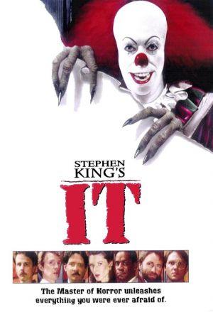
When brainstorming, creating and even finalising our productions we gained inspiration and influence from the 1990 trailer 'IT', the 'INSANE' film poster and the 'EMPIRE' magazine front cover including the joker as it relates to the idea of clowns and evil beings. They all include clown type antagonists in their productions which is why we felt we could relate to these particular products.

When coming up with our idea and brainstorming all the different character types and genres we came across the trailer's Insidious, Paranormal Activity and IT. Both Insidious and Paranormal activity include mysterious supernatural beings. In difference, IT, has a evil clown antagonist which is fairly original compared to other horror films. We got inspiration from the makeup of the clown, we bought a mask which had many similarities to the clown in IT. The bright red hair and nose connote blood and murder which are successful for our horror production. We used some of the scenes including targeting children as clowns were typically made for child entertainment. However through the media they have been made out to be eerie and suspicious beings. This trailer entitled us to gain inspiration and influence due to the props, costumes, locations and settings.

The 'INSANE' film poster was our main influence when creating out poster. The black image with red wringing is successful as it complements it standing out to the audience. We liked the half face as it leaves viewers with unanswered questions (enigma codes). For example, what is on the other side of the face?
The black and white imagery is conventional to the horror genre as tones and shadows have been created, looking eerie and mysterious. I like how the plain black background creates depth whilst creating a tense atmosphere.

Lastly the magazine cover is for the dark night film presenting the antagonist in which is the joker. The colours are fairly vibrant due to it being the joker and not a clown. The film is also a thriller compared to our horror trailer. However, the use of slogans and extras including 'free poster' are successful when persuading audiences to purchase the magazine. We were influenced to include extras like this as it helps make the product more appealing overall.


EVALUATION ELEVEN: Create questionnaire that asks your audience what they thought about narrative, characters.

1) How is the antagonist/clown represented to you?
       
   Entertaining        Scary        Eerie        Mysterious  

2) Are our binary oppositions appropriate for the horror genre? (Good&Evil)

   Yes        No

3)Do you feel our princesses (victim's) are represented as vulnerable and innocent?

   Yes        No        Mostly

4) How could we change the costume of the clown to conform to the horror genre even more?


5) Our trailer is in a non-linear order, do you feel this is successful for the horror genre? Why?


6)Do we include enough enigma codes? Do you feel the unanswered questions keep you engaged      throughout?


7)What would you change about the mise en scene to connote fright and conform to our chosen  genre?


8)Do you feel a state of equilibrium from the outset?


9)We haven't included any dialogue in our production, we used non diegetic sound including  soundtracks and sound effects. Would you prefer dialogue? Why? Do you feel you would get to  know the characters more personally?


10)We supported Tessa Perkins theory of representations changing and evolving. How do you feel interpretations and stereotypes of clowns are changing?


Monday, 6 March 2017

EVALUATION TEN: How have you established genre across three products?

Genre is often used by audiences to make viewing choices and discrimination. Issues of taste, preference, identity and pleasure are associated with particular kinds of film by individuals. Genre is taken into account by producers as they intend to make their product appealing to audiences. In recent years Adventure has been the most popular genre followed by Comedy and Action. For our production, we created a horror trailer named ‘Jokes on you’. We chose this genre as we felt it would be the most successful when pleasing our target audience. Moreover, the actors conform to the stereotypical idea of young vulnerable teenagers in a horror film.

Regarding Steve Neale’s theory of genres being created through repetition and difference, we understand that audiences want something familiar. Genres therefore create a clear idea for audiences about what is possible in films narrative world. In my coursework the use of close ups of the clown could be identified as a repetitive element of the horror genre as we want the audience to realise what the clown is and why its presence is important.
In our production, the use of vulnerable young teenagers, dark lighting, mysterious and tense soundtracks and an evil sinister antagonist appropriately convey our chosen genre as the conventions are stereotypical to horror. This reflects Barry Keith Grant’s theory whereby genres tell familiar stories with familiar characters in familiar situations. This means audiences usually have certain expectations due to the experiences in which they have already accomplished.   However, we have also used locations including parks which may subvert the typical ideas of a horror film. This reflects Robert Stam’s theory whereby he challenged whether genres really exist or whether they are merely made up by critics as films include many different conventions which may conform or subvert genre ideology. This explains that films don’t have a certain genre as producers like to incorporate different meanings to excite the audience which demonstrates hybrid genres.

Genre is important as producers use the concept in both production and in marketing as they hope to get the best reaction from audiences as well as creating a successful product. Audiences tend to have a favourite genre which helps persuade them to go and see that particular film. Fowler argues that ‘genre makes possible the communication of content’ this means that genres help portray the narrative to the audience making it seem useful. However, Hartley argues that ‘genes are agents of ideological closure, as they limit the meaning’. This clarifies that genre isn’t as important as is makes the meaning of the film less important. Overall, I feel genre is important as audiences usually have a favourite genre and tend to enjoy that variation of films more. This is reflected in the popularity scale whereby Adventure is the most popular and Documentary is the least popular. 

Friday, 3 March 2017

EVALUATION EIGHT: How do you establish the narrative in your trailer? How do they work together to sell your product?

The narrative is the way different elements in a story are organised to make a meaningful story. The narrative shows the story, what happens and refers to actions, events and characters. "Chain of events in a cause effect relationship occurring in time." Argued by Bordwell & Thompson. We see our trailer through multiple viewpoints which adds suspense and as we are privy to information in which others aren't. This is known as omniscient narration. Another horror film trailer which uses this type of narration is the 1990 Stephen King inspired IT. We get to see the clown through different perceptions and individuals who interpret the clown differently. We understand that the clown appears less frightening to children at first as he lures them in with his balloon and typical stereotypes of entertaining and exciting. Adults see the clown as much more mysterious and suspicious as his costume (mise en scene) and haunting presence aren't quite right. As an audience we get to see the clown first, recognising that he is a evil clown. We become aware to information that characters in the film aren't at the beginning of the trailer.

The structure of a narrative can be linear/chronological, non-linear, cyclical or have single/multiple viewpoints. Our trailer is non linear as we didn't want it to be in a particular order. We wanted to create a state of equilibrium from the start when introducing our clown as it helps keep viewers interested and engaged. By doing this, audiences will hopefully feel connected to our trailer and want to see the fill movie in cinemas. This supports Todorov's theory of narration. I feel this challenges our audience as the non linear order introduces different parts of the film at different stages. By doing this more questions are asked including why is the clown targeting those particular girls? What significance does the record player have? Who is under the clown mask?. This reflects Roland Bathes Enigma Codes  as it teaches and engages the audience through cliff hangers and unanswered questions. 

In our trailer 'Jokes On You' we see Claude Levi Strauss Binary Oppositions represented through the characters of the teenagers and the clown as they are presented as 'good' compared to the 'evil' clown. He states the world is arranged in terms of oppositional forces and values. Trailers in general support this view as they typically show either Good and Evil, Hero v Heroine and Love v Hate. Our trailer demonstrates Good and Evil due to it being from the genre horror and including characters such as a victim and villain (protagonist & antagonist). Information is passed onto audiences through the mise en scene as we understand that the clown is evil due to the dark clothing and exaggerated mask it wears. By filming at night, the lighting became dark, eerie and mysterious. This then creates a tense atmosphere for the viewers and audiences. I feel the effect of the costume helps audiences understand our narrative as the harsh black clothing connotes death, scare and mystery. This then leads audiences to see our character as evil and frightening. The mask is also very successful when explaining the narrative as it has a haunting presence. Straight away you are able to see it's not a normal entertaining mask, the teeth are sharp and the tones in the wrinkles create uneasy shadows and textures. 

EVALUATION SEVEN: Voice-over


EVALUATION SIX: How have you made your trailer seem like a trailer?

TITLES
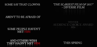
When creating our trailer, we wanted to make it as successful as possible by conforming to the horror genre and overall, looking like a trailer. During the editing process we added titles throughout engaging audiences but also advertising and selling the trailer. To help introduce our antagonist to the audience we used titles which helped portray the idea of a clown and the eerie and mysterious stereotypes/representations. We explain that this particular clown isn't one which would bring entertainment or excitement. Our trailer is a horror so we demonstrate that he isn't one you would want to meet. We changed the 'Him' to red as it connotes blood, death and scarce, conforming to the horror genre. These are appropriate when making our product seem like a trailer as they are giving informing the audience about the plot without giving too much away. Other titles we used were to help advertise and sell the film. By including that the film has been rated 'Scariest film of 2017' by a popular magazine and that it's won 'Audience choice award' in fact persuades audiences to see the product as its been spoken about positively in the media. Lastly we use 'This spring' to tell viewers when the trailer will be out. This is important as it makes audiences aware of when they will be able to see the film if they enjoyed the trailer. We used a 'Smear' effect on the titles as a more captivating way of exiting the screen. The titles become sharp looking and look as if blood is dripping of the letters conforming to the horror genre. I feel our titles are effective when making our construct seem like a trailer as they help set the scene, explain the story and advertise the overall film.  

EDITING
When editing our product, we wanted to use as many successful edits and transitions to help make it look as much like a trailer as possible. Firstly, we used a 'Smear' effect on the titles as a more captivating way of exiting the screen. The titles become sharp looking and look as if blood is dripping of the letters conforming to the horror genre. Between scenes we used either a 'Dip to black' or 'Dip to white'. The dip to black is effective as it closes the scene creating suspense and questions dud to not knowing what will happen next (Enigma codes). The dip to white is also useful when brightening up the scene subverting the general stereotypes of horror as it makes the trailer look as if something positive will happen. We used the black and white filter when showing the record player. We thought this would be useful as the tones and shadows help make the scene appear eerie and mysterious. This helps make the product look like a trailer as companies are unlikely to use filters in films as it breaks continuity. In trailers you are able to add effects and transitions to help it run smoothly whilst keeping audiences interested. We used a 'Additive Dissolve' when showing our clown as it faded into the background. This is effective as it makes it look like the clown if being presented multiple times. In a film this would't work as it would break continuity. However, in a trailer we are able to confuse the audience leaving them asking questions and mix scenes together as it doesn't have to be in order. 


SOUND
To make our trailer seem like a trailer we used one main soundtrack throughout our tailer with different sound effects. We didn't include any dialogue as we thought it would look more like a opening two minutes. Mostly, non-diegetic sound used as we thought it would help make our product seem more like a trailer than anything else. Our main soundtrack was chime like conforming to the horror genre. It sounds creepy and mysterious as we wanted to portray the clown in a negative light. Sound effect include ticking as it implies the protagonist is running out of time and the clown is fast approaching. We used heavy breathing as we show our protagonists running away from the clown. This is effective as it makes the audiences feel anxious and uneasy. We have a child narration as it reflects the idea of clowns and their main purpose of entertainment for children at circuses. This appears very frightening and tense as the girl is talking very mellow and slowly. The dark scene also fits nicely as it makes it more far more compelling. We used a circus tune to reinforce the clown. The sound effect is loud and fast pace, which creates a tense atmosphere. Our sound is appropriate for a trailer as it engages audiences and fits all the scenes and jump cuts together. It also works throughout the whole of the trailer, meaning viewers aren't left feeling confused. 

MISE EN SCENE

To make our product seem like a trailer, we wanted to use different locations so we could use jump cuts  to portray parts of the story to the audience. We filmed in parks, residential areas, cars and houses to show different timings and days reflecting the idea of a trailer. We also filmed at daytime and nighttime to conform to the horror genre whilst showing different times of the day. This makes it seem more like a trailer as it's not like its only showing one day which is like a film or opening two minutes. For costume, our protagonists are shown wearing different outfits in different scenes. We wanted to make our trailer seem like its been recorded day by day as it looks more like a trailer. If our characters were wearing the same thing the whole time it would appear more like a opening two minutes. Our antagonist, the clown, is shown wearing the same black outfit and mask as we wanted audiences to think there is only one clown. I feel if the clown changed outfit it would look less realistic or supernatural. We also used a balloon in only one or two scenes as we thought if we used it throughout it would look too much like it's been recorded on the same day. Trailers in the real world portray people lives over numerous days/weeks/years. We wanted to make our trailer look as if it had been made over many days to help look more like a trailer. This is why we changed costume, location, props and timings/lighting. 


CAMERA
We used many different camera angles including long shots to show body language and setting, close ups to show emotions, panning and establishing shots to set the scene, low angles to show power and authority and over the shoulder shots. We wanted to use as many different camera angles to help portray different moods and meanings in our trailer. The effect is successful as it makes our product look more like a trailer than an opening two minutes. In a trailer, jump cuts are usually used to change location, setting and character. By using different camera angles, audiences get different meanings and information. Trailers are made to advertise films and engage audiences. Our creation successfully does this through different camera angles as it helps show key points of the film in a short and simpler way.


THEORY
We have conformed to many theorists when creating out horror trailer. We portrayed a disruption of the equilibrium by some action when introducing the killer clown. We wanted to leave our trailer with the state of equilibrium as it engages the audience more. This supports Todorou's theory of narrative. In our trailer we have The villain who causes disruption (clown) and the princess/victim (three teenagers). This supports Vladimir Propp's theory of narrative. Binary oppositions are used in our trailer whereby we portray good and evil. The clown is the evil antagonist and the innocent protagonists are good and vulnerable. This is argued by Claude Levi-Strauss that the world is arranged in terms of oppositional forces and values. We also wanted to show Enigma codes, whereby our audiences are left with unanswered questions, tantalising and engaging them. For example, why is the clown in the park? Why are the girls at the park at night? Who is behind the clown mask? This supports Robert Bathes theory as trailers intend to leave audiences with questions as hopefully they will go and see the film when in cinemas. Our clown is represented as evil, mysterious and frightening. This supports Tessa Perkins theory whereby, truthful representations are changing and evolving. Clowns are no longer mainly stereotyped with circuses and entertainment. 

EVALUATION FIVE: Presentation- feedback from test audience and analyse in detail of findings.


Wednesday, 1 March 2017

EVALUATION FOUR: How did you use titles and how did they advertise your film in your trailer?

Firstly we created out production credits. We came up with 'Purple Lake Productions' as a distributer as we thought the photography looked mysterious and eerie, conforming to the horror genre. The additive dissolve transition is effective as it changed the image from black and white to colour. It helps build suspense and engages the audience. We named our production company 'On Track Productions' as we thought it sounded professional, bearing in mind it's original and chosen by my group. We then found a black and white 'GIF' whereby it looks as if the viewers are sat on a train travelling down the tracks. This is also in black and white as it has a more creepy and frightening effect conforming to the horror genre. We feel these production credits are appropriate when advertising our trailer as they are unique and original. They make viewers feel interested and more enticed to carry on watching and see what the trailer and companies have to offer. The imagery is also at a high standard quality making the overall product look professional and expert. The use of the ticking soundtrack is effective as it makes audiences feel they are running out of time as they are travelling up the tracks. This reflects our chosen genre as it creates a tense atmosphere and leaves viewers feeling uneasy.

Throughout our trailer we included titles to help piece together every scene. Firstly we have 'Some say that clowns'. this is interesting as it leaves the viewers questioning what the answer will be and what the trailers opinions are on clowns. They also may not know how the clown is being depicted, meaning they will carry on watching to find out. Next we have 'Aren't to be afraid of'. This one is used to show that there are two types of clowns, friendly and entertaining but also evil and murderous. I feel this is effective when advertising our film as it subverts the expectations of a horror, however creates questions and thoughts from the viewers. Furthermore, we have 'Some people haven't met him'. We used this as we wanted to narrow down the questions to one particular character. By doing this, audiences begin to realise there is only one antagonist and only one clown. We made the 'Him' red as it connotes death, blood and danger. This is effective when portraying our antagonist as evil and frightening. Lastly, we have 'And others wish they hadn't met him'. This is successful as it answers all the questions and demonstrates our antagonist as creepy and scary. It shows how the clown has a haunting presence, and isn't wanted to be seen. We  have this 'Him' in red  the same reasons and meanings. All the titles work well together when advertising our product as it keeps audiences interested and keen to find out what's going to happen as the titles read the story in more detail. We added a 'Smear' transition to the titles meaning they close down on screen. This conforms to the horror genre as they become sharp looking which suggests slasher, but also looks like dripping blood which suggests death and murder.

We wanted to make our trailer appear successful and popular. We included 'The scariest film of 2017-Diverse Film'. This is a quote which we took from our magazine as we wanted to link them together. The quote is appropriate as it makes our trailer seem like its extremely scary appealing to thrill seekers and people who  enjoy getting scared. As our film is a horror it helps make it conform to the genre and stereotypes. I think this helps sell our trailer and we found that the majority of our target audience favour horror films and like the feeling of being tense and anxious. When reading the magazine they will be persuaded to watch the final product of 'Jokes On You'. Furthermore we have 'Winner of audience choice award 2016'. This demonstrates that our film has been chosen by audiences, viewers and members of the public as one of the most successful films of 2016. This will convince people to watch the film as if something is popular in the media, people are far more likely to go and watch that particular film. Lastly, we have 'This Spring'. This is effective when advertising our film as its giving the release date the the viewers. Once people find out when the film is being released they are more likely to remember the date and go see the product.We continued to use the 'Smear' transition as it conforms to the horror genre whilst looking like all the other titles. 

The final title we use is 'Jokes On You' which is the name of our film. We have it large scale taking up the majority of the screen. This is effective as its a bold statement and finally tells the audiences what the film is called. It advertises the trailer as it enforces viewers to write about the trailer online receiving viewers and attention.

Tuesday, 28 February 2017

EVALUATION THREE: How alike film posters and magazines are your ancillary texts?

OUR MAGAZINE:
When creating our magazine we wanted to have an image of the clown displayed on the front to advertise the type of film successfully. We used a black and white image to get a more negative effect. We thought it reflected horror more appropriately than if it was in colour. The tones and shadows produced due to the black and white effect create a more tense and eerie atmosphere. We named our magazine 'DIVERSE' as we thought it reflected a range of ideas and didn't make audiences assume one particular genre or film type. For example the magazine 'EMPIRE' makes me think of thriller/action adventure due to the powerful and bold name. We did use bold capital letters to make it look more engaging and exciting. To really stand out as a magazine we used catch lines either side of the image. These include 'Purple Lake Productions brings you a remake of the 1990 hit film!' and 'Insights to the latest news and spoilers inside!'. I feel these help sell the magazine and film as people become more enticed in the magazine and connect with the producers/directors. We used a barcode to make the magazine look as realistic as possible as we want viewers to believe they could actually go out and buy our magazine. Lastly, we placed a blue circle on the front cover explaining there is a poster inside. This is effective as fans will buy the magazine for the poster making profit and advertisement. I feel our magazine is alike real magazines as we have included a original name for the magazine, placed a single image as the front cover, included a barcode and advertised our film effectively. When researching magazines we got inspiration from 'EMPIRE', 'TOTAL FILM', 'ENTERTAINMENT' and 'CONTENTS'. All these magazines advertise popular and globalised films which suggests they are favourites in the media. We wanted our magazine to look as professional as possible, this is why we chose to make our magazine look fairly like these ones mentioned above. To improve our magazine I would change the colour of the circle to either black/white as I feel the blue subverts horror and take attention away from the overall image. Overall, I feel our magazine sells our film effectively looking realistic and successful.

OUR POSTER
When creating our poster we had much inspiration from the film 'INSANE'. We really liked the idea of having half the clowns face in shot and display it in black and white. The black and white is successful in creating a tense and eerie atmosphere due to the harsh tones and shadows created. To make our poster as original as possible we left the nose in red. We also feel the pop of colour stands out taking the viewers attention and luring them into the rest of the poster. We included the name of our film, actors names, distributer etc and a catch phrase. When looking at film posters we saw that many of them included a catchy phrase to keep the viewers interested. Our poster is alike real film posters including 'INSANE', 'IT' and 'THE GRUDGE'. This is because black and white is used to present the genre horror as it is suspicious and creepy. The effect is has on audiences is successful as it makes them feel uneasy and tense. I feel our poster is very much alike real film posters as it uses our own photography, its engaging and it includes all the main aspects to a film poster.

Sunday, 26 February 2017

EVALUATION TWO: How does the use of sound compare with trailers of the similar genre?

Sound which we have used in our trailer includes a chime like soundtrack, circus atmosphere sound effects and creepy children whispering thoughts. The main sound we used is non-diegetic as it's not in the scene or made by the characters (dialogue). 

The soundtrack to Woman In Black, is extremely similar to the soundtrack we used when creating our production. It uses a chiming sound, whereby there are ticking noises every so often. They then use a child's voice as the narration. This is also similar to ours as we included whispering sounds as it creates a more tense and suspicious atmosphere. Both are also non-diegetic as they are not created by characters or objects in the scene. The child narrative is effective as the film is based around the death of a child. I also feel its appropriate for our trailer as clowns were ideally made for children entertainment, not murderers. The soundtrack begins to speed up becoming more taut and uneasy. It positions viewers too feel slightly distressed and anxious as you feel like something is going to make you jump or frighten you. In our trailer, the soundtrack also speeds up as we felt it would help keep the audience excited and engaged in our product. 

IT is another trailer which has similar soundtracks and sound effects. It opens with a fast pace chiming noise which reflects the soundtrack to our trailer. The tempo increases and becomes quicker to create a tense atmosphere and keep the audience engaged. The IT trailer also doesn't include any diegetic sound as the soundtrack is so effective in portraying the clown in a frightening and spooky way. By the end of the trailer, the soundtrack begins to become circus themed. This conforms to the idea of the clown and its usual surroundings. Our trailer also includes circus noises as we thought it would reflect the atmosphere well and also make viewers feel uneasy. 

Overall, sound in horror is mainly creepy, chime like, slow to fast pace and mysterious. The producers want to scare viewers and keep them interested. Sound effects used are howling winds, door squeaks, screams and so many more. Sounds used also need to reflect the theme, atmosphere, character and location. If they didn't do this then the trailer wouldn't make sense and audiences wouldn't be focused. 

EVALUATION ONE: Have you subverted or conformed to stereotypes typical of your genre?

When creating our product, we knew we had to conform to the main stereotypes in the horror genre, including an antagonist, protagonist and victim. However, by subverting the usual expectations, audiences become more engrossed in the media text, being persuaded to go and watch the film in cinemas. 
Our antagonist is the clown. We got our main inspiration from the original film 'IT' as it included a evil and mysterious clown. This conforms to the stereotypes of our chosen genre as the clown is eerie, murderous, suspicious and frightening. We wanted to present our clown as peculiar, helping keep audiences interested. We presented our clown in all black clothing with a bold and dauntless mask. The conforms to the conventions and stereotypes of horror as it's used to scare and frighten viewers. 
Our other three characters in our trailer are the three victims. We wanted to show them as innocent, vulnerable and endangered to help conform to the horror genre. We chose outfits that were fairly basic including minimal colours and patterns to help make them look faultless. 
The soundtrack of our product is extremely freaky whereby it sounds like chimes are playing. We also use multiple tracks including creepy children whispering and circus noises. This conforms to the idea of the clown and its surroundings as well as reflecting horror and the intentions to scare viewers. 
When editing we used the transition of 'dip to black' this is effective as when leaving a scene it leaves audiences questioning what will happen next. 
We used a non additive dissolve when editing to show one scene fade onto another. This effect shows the clown in the background fading away. This conforms to the conventions of a horror as it makes it look as if something is watching you, and you don't realise its there until you look deeper into the scene. With the children whispering in the background it creates a completely tense and unnerving atmosphere.
We subverted the stereotypes and conventions of a horror due to the location settings. For example, a park wouldn't usually be used in a horror film as its a place for enjoyment and happiness. However, as our antagonist is a clown we thought it would be effective as clowns lure in children and target them. We managed to subvert expectations but make it work efficiently in our product.
Another area whereby we subverted stereotypes is when we use the record player. Even though we made it black and white to help create a tense atmosphere the diegetic sound is jazz. This reduces the alarming effect of the trailer. Although, it may keep audiences asking questions as it keeps changing from scene to scene. This is an example of enigma codes by Roland Bathes as the trailer isn't fully explained, tantalising the viewers.
We reinforce the idea of binary oppositions as there is a clear divide between good and evil. The clown is the eerie and evil character whereby it targets victims and aims to kill them. The innocent and pure teenagers are good as they are only making their way home from school and not asking for their torture. 

Thursday, 9 February 2017

Our Final Poster


Creating Our Poster:

   Which One?

Here are our two designs for our final poster. We got inspiration from the poster 'INSANE' as we liked how they used half of the clowns face as well as presenting the poster in black and white creating a eerie effect. We used a black background as we thought it created depth to the image whilst conforming to the horror genre. We placed the title vertically, on the side of the poster as it looked original, thereby becoming more creative and imaginative. Underneath the title is our catchy slogan which states "Whats the matter? You look like you just saw a clown!". We used this slogan as we thought it linked to our trailer appropriately. We placed it underneath the title as we wanted people to be drawn to that first. If it was placed above audiences may be less likely to connect with the poster and look further into it. We used the same font and style for our title as we feel the balloon on the first 'O' has a strong effect and makes it look more successful. At the top of the poster we have my groups names, we noticed when exploring other posters that they include the main actors names at the top. This influences audiences to watch the film as if they particularly like that actor they will be more inclined to see the film. Located at the bottom of the poster presents the editor, producer etc. We wanted to show of who did what whilst displaying the usual qualities of a film poster. We used photoshop to create our poster. This enabled us to make a black background, crop the clowns face, add text, change sizes and place the balloon on the font. 

The only problem is...Which one? The first poster on the left shows the clown in colour. This makes the poster appear brighter and more engaging. We moved the scales on the brightness and contrast to help increase the tones and highlights. We really liked it at first, however, we had an idea of seeing what it would look like in complete black and white. We created a new layer on photoshop, whereby we could make the clown black and white without making the balloon in the title loose colour also. We preferred the outcome before changing the levels etc. We edited the levels to increase the tonal variations and highlights. The darker areas are presented far darker which creates depth but also looks more like 'INSANE' the poster which gave us the most inspiration. I feel the black and white looks scarer and more mysterious. The colour compared to the black and white looks fairly amateur and comedic in my opinion. Lastly, we thought we could have the nose in colour as it would complement the red in the balloon. As we created a layer it meant the coloured clown was underneath. We were able to use the eraser tool to bring the colour through. To get a accurate precision we changed the size of the brush and hardness so its completely accurate. I like our final poster as I feel its professional, engaging and frightening. This presents our genre of horror well and in my opinion persuades audiences to go and see the film as the picture is captivating and reflects the slogan effectively. 

Wednesday, 8 February 2017

Our Magazine:


Film Poster Inspiration:

The inspiration for our film poster has come from 'INSANE' mainly. Firstly, its a horror, includes a clown and is presented in black and white. It's very similar to our trailer whereby it's based around a supernatural being (clown). On our film poster we want to include a image of the clown, the title, the production company and the names of my group. We want to do this effectively without giving away too much of our trailer.

We particularly like the layout of the poster. My group feel the half face shot is extremely successful as it builds suspense and makes the poster more captivating. The dark areas around the mouth and eyes are extremely strong as it creates depth whilst also having an eerie effect. The smile of the clown also looks mysterious and suspicious due to it being a horror film. The black background is appropriate as it connotes death, murder and fear due to its negative perceptions. We would be able to do this using photoshop, as we can crop photographs, change the colour and emphasise on the tones and highlights.
We also like how the title is located near the bottom of the poster in block capitals. The block capitals stand out and look inviting. The colour red is slightly cliche as it connotes blood and murder which gives away too much. This is why our title is in white with only a small red balloon on one of the 'O'. We hope to place the title in around the same place as most successful posters place their title there. This poster includes actors names which helps advertise and sell the film, it influences audiences as they may really like that particular actor. We want to show who stars in our film and hopefully persuade people to see it. Myself and others in my group are lucky as we take A Level photography which enables us to use photoshop effectively and professionally. We will be able to create our poster in a exciting and original way as we will be able to lots of different techniques including levels and the clone stamp. 

Institution-Purple Lake Productions.

Our chosen institution to use for our trailer is Purple Lake Productions. We chose to call it 'Purple Lake' as it's a sophisticated and professional looking name in which helps portray our trailer from a successful and well known distributer. We used a image whereby the lake is presented purple as it connotes power, ambition, mystery and magic which helps reflect our genre which is horror. Many companies use simplistic locations as their image, such as a mountain for Paramount. We then took the image further by opening it up onto photoshop. We edited the brightness and contrast enabling the tonal variations to have a bigger effect as they create shadows and highlights. The image therefore, becomes eerie and tense.  We also moved the scale towards the purple shadows on the hue and saturation as we wanted to emphasise on the purple tones. The overall outcome is successful as it links to the horror genre, and makes the audience feel uneasy and anxious. I feel it works well when opening up our trailer as the colours and image are particularly engaging. 

Once we had finished editing the image, we opened it up onto Adobe Premier Elements 10 and placed it at the beginning of the trailer. To change the width of the image and height we pressed CTRL T enabling us to decrease and enlarge the photograph. We wanted it to be the perfect size so it didn't look unprofessional or amateur. We added a colour effect to the image. This meant as the trailer plays the production credit will change to black and white then go back to normal. This is effective as it becomes engaging, but also used by professional and worldwide distributors. Lastly, we used a dip to white transition to help keep the trailer flowing. The dip to white is successful as it opens up the trailer by making it look interesting and inviting. We didn't use a dip to black as its used throughout our horror trailer and we thought by opening up with one it would look too repetitive.

Sunday, 15 January 2017

Creating Our Magazine!

Our main inspiration when creating our magazine front cover was from 'EMPIRE'. Much of my research located in previous blogs has been from the magazine 'EMPIRE' as I feel its extremely successful when advertising films as well as selling it to the audience. This is due to the bold, extreme title, engaging photographs/pictures and exciting, catchy texts.  
It took a while for myself and the group to think of a name. We wanted something that stood out to audiences and made people intrigued in to what it would include and advertise. After much discussion we decided on the name 'DIVERSE'. This is because the term diverse suggests diversity and differences. We feel it makes the magazine appear different and include many other types of film genres. Even if the viewers aren't all horror enthusiasts, there will be other genres located inside. When displaying the title of the magazine, we want it in bold white capitals. This reflects the magazine 'EMPIRE' as we feel it looks appropriate and not amateur. We will use a fairly standard font as when we advertise our film, the font for that is much more horror like. We don't want the magazine cover to look over the top or silly. 
For the background of our magazine, we will use one of our own photographs which includes our clown standing in a strong and powerful position. By using photoshop we were able to remove writing on the balloon by using the 'Clone Stamp'. The balloon had 'BEWARE' written on it, we felt it made the cover look inappropriate and foolish. Next, we made the photograph black and white as we thought it looked more eerie and frightening. It will also complement the white tile 'DIVERSE'. By changing the brightness and contrast scale, the tonal variations enhanced creating a more engaging and successful image. It looks much more scary and daunting this way.
For the film title, we used a sharp mysterious looking font in capitals and in white. We made every other letter bigger than the other. This makes it conform to horror connotations and expectations as it looks as it it has been written by a suspicious child with a sharp object. We also placed a balloon on the first 'O' in 'Jokes' as its what we all decided on when deciding our trailer name. We are going to place the trailer title at the bottom of the the magazine as we don't want it to cover any of the photograph.
All magazines have a cost! we have placed a barcode at the bottom of the magazine as it helps make it look more realistic without taking any attention away from the image or titles. 
Lastly, on the edges of the magazine we have included text. We have explained where we got inspiration from (IT), sells the magazine with a free poster, and tells audiences there are spoilers inside. We felt we didn't want to give too much away on the magazine cover, so included short snappy phrases which will hopefully get viewers attention!


Friday, 13 January 2017

Research and Planning Targets

To improve your response make sure you are explaining the strengths of things posted, such as your animatic storyboard.  Well done Mae - a fantastic effort.