Wednesday, 7 December 2016

Software Research:

When making our products during A2 as well as AS, we wanted to use the most professional and experienced software which would help make our final product exciting and masterly. During editing the type of software is essential for gaining a high grande and achieving successful things. It's likely for A2 we will use Adobe Premier Elements 10 like AS as we understand how to use it and managed to create a high graded opening two minutes last year. As a group we know how to cut, paste, transform, include soundtrack and do other interesting and skilful edits. 

Adobe Premier Elements 10
This is the software that we used during AS level. It was extremely useful last year, as our teachers were able to explain effectively how to use it to the best of our ability. It only seems ideal to use again as we all have familiar recognitions with the software. It presents a simple layout, which has obvious names files and sections, including timeline, get media, transitions and render. This software would benefit our trailer as we are able to do many professional things including, edit a green screen. Unlike other softwares, like movie maker, we won't be able to get the advanced settings. Transitions such as fading to black are useful when making a horror film, as it leaves a tense and suspicious atmosphere. 

Movie Maker
We used Movie Maker when making our animatic storyboard. It's a fairly simply and easy software which allowed us to place one piece of un-copyrighted music to the soundtrack and put all the images together as a slideshow. The software is very simple and not good enough of A level. We wouldn't be able to use transitions to help create tense atmospheres as well as changing the type of music to fit the scene. The only benefit from Movie Maker, is that it's quick. Unlike Adobe it is fast at processing and uploading. This is only due to Adobe being more advanced and professional taking longer to upload quality footage. It a good software to use for storyboard and shot clips like merging character interviews, however, I wouldn't feel it would be successful for creating out final product. 

iMOVIE
iMovie is a software on apple devices including Macs, iPads and  the iPhone. It is a very good software for creating trailers as it makes it's own titles and fonts to fit your genre type. This isn't great as we want to make out own titles, which will fit perfectly to our type of trailer. We also need to write about the editing techniques in our exam which means there won't be much to write about with iMovie. There is another section to iMovie which is more useful when making a film. As we are making a trailer we need it to be short and effective with the appropriate titles etc.  

Filming-Ashtead Park

We filmed at Ashtead Park on the 29th November. We arrived at the park at 18:00 and walked up to where we wanted to film. We had a few problems at first. This included changing the camera settings to night mode, loosing the batteries for the little ring light for lighting and having trouble with the tripod. After about 15mins we managed to get everything working effectively and began filming for our horror trailer!

As you can see in the picture, we used our own ring light which was ordered of Amazon as well as phone flash lights to generate light. We found these very helpful as they capture the best angles as well as reducing the darkness! The ring light had three different settings of brightness, we found the second setting to be the best as the others were either slightly too dark or slightly too bright. There is also a clip on the light, which means we were able to position it on, and around the camera in order to make the clown/main subject appear clearer in shot. We also have a tripod, this enables us to capture a clear and crisp shot without it looking blurry or unbalanced. The tripod comes in extremely handy due to it having a handle to change direction and angles. For example as our trailer is horror we felt a canted angle would be successful to use. By having the tripod we were able to accomplish this. When making our magazine cover and poster the tripod and Nikon D3000 will allow us to take professional looking photographs and videos.

At the park, the main parts we wanted to capture were of the clown. This includes Katy to be dressed in all black with a clown mask on. We will be using this mask throughout the trailer as we feel its successful when creating fright and tension.  As a trailer shows different events and days we want our characters apart from the clown to have different outfits. However, we still want them to be wearing mainly dark colours and simplistic clothing as it conforms to the horror genre and ideas. Our coats, trainers and jeans imply that we are young fashionable teenagers who are vulnerable and innocent. The Park is ideal as it links to children which also reflects clowns. As they are usually made for entertaining children, although have a negative stigma which makes them appear scary and sister. Without spoiling our trailer, we took many shots, which hopefully conform more to supernatural events than gore. This includes a scene where the swing is swinging all by itself. We don't want to include gore as we feel it may not look as successful as we want it to.

Questionnaire Results Findings And Analysis:

For our questionnaire, we wanted to find out what individuals aged from 17+ thought about horror genres and stereotypes. From completing this questionnaire we have gained many different ideas and objectives in which to make our overall product as successful as possible.

The first question asked to our respondents was "Who would you prefer to see as the antagonist?". It was a fairly close result however with 53%, females got more votes than males with 47%. This demonstrates that our sample prefers to see the antagonist as a female character. My group found this very surprising as we assumed males would get more votes as they are portrayed to be stronger and more powerful. I feel females received more votes as they are able to create a sinister and eerie presence. For example young girls are used in many horror films including 'The Orphan' and 'Paranormal Activity'. We found this question helpful as our antagonist is played by a female and hopefully will get as many positive responses as possible.
Our second question was, "How many films do you watch weekly?". From our results we found that a wide majority of people watch around 1-2 films a week. Our graph shows that 63% watch 1-2 and 37% either don't watch any or more. We found our results fairly surprising due to our target audience of 15-25 year olds. We expected them to watch many more films due to being young and having more time on their hands. When we thought about it we realised that education and work may get in the way of watching more that 2 films a week. We just hope that our trailer will be as successful as possible and become one of the 1-2 films that are watched per week!
Our third question was, "What location do you find most daunting?". We found that a park got the most votes gaining 41%. This is due to it involving children and different age groups at night. This creates an extremely creepy and frightening effect to the trailer helping it conform to the horror genre.
Our fourth question was, "What's your favourite horror film out of the following?". From our list of films 'Paranormal Activity' received the most with 33%, the 'Saw Franchise' followed second with 29%. I feel 'Paranormal Activity' won as it's a supernatural horror film which includes ghosts, spirits and jumpy scenes. It included video diaries which help create tension and suspense. I agree with the respondents that supernatural horror films are the most alarming.
Our fifth question is "What genre do you prefer?". Horror got the best result with 47%. This is pleasing as we have created a horror trailer which we hope to get many views on. As our targeted audience 15-25 year olds chose horror, we feel we are in a successful position with gaining views and having a victorious product.
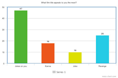
Our sixth question was, "What film title appeals to you the most?". The title 'Jokes on you' was the most engaging receiving 47% of votes. We feel this is because it gives slight hints about the type of film, however, doesn't give away too much. People who enjoy the suspense of horror films and like being frightened may feel that clowns are a good character to use as an antagonist.
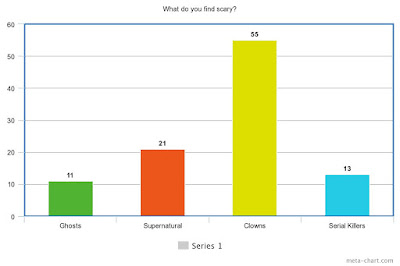
Our seventh question was "What do you find scary?". Luckily clowns got the most votes with 55%. We are very happy with this statistic as we hope that out horror films is frightening to the audience and that they enjoy the tense and suspicious creations. Although we hope they don't find it too scary!!
Our eighth question was "Who do you think will portray the protagonist the most effectively?". A young girl got the most votes with 77%. We believe this is because she can appear extremely frightened and scared through costume, camera angles and acting scenarios.
Our ninth and final question was, "Do you think its important to see the antagonist in the trailer?". 87% of respondents said yes. This is due to them wanting to know what to expect and what the film will be based around. The small 13% that said no probably feel that it would spoil the film and give away to many hints.  We will be showing the antagonist in the trailer as we want audiences to understand what our film is about and hopefully feel gripped and enticed to see the final product.

Monday, 28 November 2016

Titles Test:

Myself, and the others in my group, sat down together on Friday afternoon and started designing titles. So far we have chosen the name of our trailer and the main design. This involves the name 'Jokes On You' and a red balloon located on the first 'O' in 'Jokes'. 

This is our first design, we chose red block capitals, the balloon on the first 'O' in and no outlining colour. We like this design as its fairly plain and basic, it says a lot without looking too dramatic. The red connotes blood, death and murder which is appropriate when reflecting a horror trailer. The balloon also helps describe the events in the trailer without giving too much away. We like this design, however, we feel we can approve hugely to get the best outcome for our title. We feel a thinner font will be more successful and appealing, the big block bubble writing looks slightly immature and fades away from the horror genre. We will make many more developments and improvements to get the best overall outcome. 
       
This is our second design. We changed the font, making it thinner block capitals, although still including the red for effect. The red helps suggest blood, murder and slashing which is perfect when producing a horror product. We also changed position for the balloon. We placed it on the second 'O' in the title. As a group we feel this is less effective and captivating. We prefer the original idea of keeping the balloon on the first 'O' present. However, we feel the font is far stronger than the previous design as it looks less cliche/juvenile. We also played a apostrophe on 'JOKE'S' as we forgot on the first design, which would be a huge faulty when displaying our trailer. We will keep developing our design in order to fit the trailer perfectly. We also all need to agree on the perfect title as its fair if everyone likes the final design.

This out third design.We kept the font the same yet, moved the balloon to sit on the first 'O'. We feel this works much better and overall looks far stronger. We really like the thinner more unique font as its less cliche. The black outlining also helps it stand out amongst the white background. The redness of the font implies blood, death and clown as their hair is usually thick red curls with a bright red nose. We want the title to hint at clown ideas but not give too much away. We feel the balloon is a sweet touch in giving the viewers sneak peaks. This is my favourite font as it looks quite sophisticated and original. I like the colour, positioning, size and style. I just hope my group feels the same when choosing the font!!


This is out fourth design.  We kept the balloon in the same place however changed the font and colours slightly. The red deepens into burgundy black tones which is effective when demonstrating fright and horror. The style of the font has also become more flexible not strong sharp edges. I feel this makes the design weaker as we want the design to appear superior and powerful. We don't want it to come across as comedic or amateur.
FINAL TITLE

Film Plan For Next Week:

Filming Day- Tuesday 1st December.

Meeting at 18:00 at Ashtead Park- This will enable us to capture the scene whereby The Clown is wondering around the park late at night. The dark winter, time of day will help reflect night time and a more sinister effect. 

18:20, Reflection Time- We will look at our footage and see what we need to change and improve, this will make it easier when editing as we know we don't have to go out and re-film scenes. 

18:40, More Filming At The Park- By this time we will have many parts of our trailer filmed and prepped for editing. We want to have evil and freaky scenes where the clown is sat on the swing, peaking behind a tree and following young children. We will use our actors as children so it doesn't effect the public. This is also why we leave the filming till later so there is none interfering. 

19:20, House Filming- We will change location to one of the actors houses. This is where we will film scenes whereby the house appears haunted and The Clown finally comes face to face with the girls. A panning of a normal room with a weird, mysterious record player playing we feel would be ideal for the opening shot of our trailer. 

Costume:
As we are filming a trailer, the costume and appearance of our characters isn't necessary to be the same throughout. As long as The Clown appears the same due to it's suspicious and unnatural being the overall outcome should be successful and not break continuity. The other characters will still wear dark and normal colours to appear as your average teenagers. The dark tones just help bring the horror genre alive.

Friday, 18 November 2016

Research and Planning Feedback

Explore more about the impact your questionnaire results will have on your final production and evidence your time-management as a group.  Keep evidencing your journey towards final production!

Representations And Stereotypes In Our Trailer?

In a horror film, there are always Antagonists and Protagonist. The Antagonist is usually a supernatural mysterious creature or a murderous serial killer. Including Ghosts, The Grudge, Spirits, Paranormal Activity and George Harvey (The Lovely Bones). The Protagonist is presented as innocent, vulnerable and usually in their late teens/early twenties. Females are usually easier targets are they are frightened far easier and make the film appear more suspicious and alarming.

The Antagonist:
-Mentally Ill
-Vicious
-Violent
-Serial Killer
-Confused
-Black Clothing
-Blood
-Weapons
-Strange
-Aggressive
-Frightening
These are some representations and stereotypes of characters that play The Antagonist. For example Pennywise the clown in 'IT' is represented as violent, aggressive, frightening and strange. It's made to create a tense atmosphere and taunt the audience.

The Protagonist
-Vulnerable
-Innocent
-Young
-Female
-Weak
-Loner
-Family's
These are some representations and stereotypes of characters that play The Protagonist. For example in Paranormal Activity the whole family is being haunted by the spirit including children. All characters are innocent and vulnerable who don't deserve the aggressive torment. In 'IT' the clown lures in children and other female characters which conforms to the stereotypes of young female characters being the target.

Questionnaire:

1. Who do you prefer to see as an antagonist?

A) Male     B) Female


2. How often do you watch a film weekly?

A) None  at all    B) 1-2 Films 

C) 3-4 Films      D) 5+

3. What location do you find the most daunting?

A) House         B) Alleyway

C) Woods         D) Park 


4. What was the last horror film you watched? Did you enjoy it? If not, Why?

____________________________________________________________________
____________________________________________________________________
____________________________________________________________________

5. Do you think that it is important to see the antagonist in the trailer?

A) Yes        B) No 


6. What is your favorite horror film out of these films?

A) IT           B) Paranormal Activity         C) The Exorcist 

D) Drag me to hell      E) Cabin in the Woods    F) Saw Franchise 


7.  What genre do you prefer?

A) Horror   B) Action 

C) Thriller   D) Romance    E) Comedy 


8. What film title appeals to you the most?

A)  "Jokes on you"    B) "Revenge"

C) "Karma"        D) "Joke" 

9. What do you find scary?

A) Ghosts    B) Supernatural 

C) Clowns   D) Serial Killers 

10. Who do you think will portray the protagonist most effectively? 

A) Young girl  B) Teenage girl   C) Young boy 

D) Teenage boy  E) Old lady    F) Old man 

Wednesday, 2 November 2016

A Day Of Filming!


Wednesday 2nd November 2016:

Today was our first day of filming, we managed to film many different shots of our clown character as well as scenes of the innocent girls walking from location to location. We tried to use locations in which there would be children about and normal public places. This should hopefully appear more realistic and relatable for audiences. Unfortunately, it didn't get dark quick enough so we weren't able to get the most frighting and suspicious shots of our clown as the lighting was too bright. Hopefully when we next film we will take advantage of the darkness and dull lighting to conform to the horror genre and get the most successful and gripping shots possible.  So far, from what we have filmed I feel its coming along effectively and strongly. Today, we mainly used locations including residential areas, alleys, parks, ponds and train areas. We want the 'walking home' scenes to look as realistic and usual as possible. We don't want it to look quiet and staged meaning the more popular locations the better. We want the clown to always appear eerie and alarming, this is why we used a low angle of a crossing bridge to make it look superior and powerful. The extreme long distance shot also shows it at a distance which has a more creepy and strange effect. I feel the rustling of the trees and zoomed out shot help get an overall stronger horror trailer.


In this image, we see the location of the pond. We used this as a long shot to show the 'innocent and vulnerable' girls walking home. We thought it would look realistic and relatable. We also managed to film a flock of birds flying around in circles which create tension and helps make the trailer seem more twisted. The dull lighting is also effective as horror films are usually depressing, frightening and eerie. This wouldn't work if the lighting was really bright as it wouldn't look scary enough. We feel the long shot is effective as you are able to see around the shot, body language of characters and  look as if something is watching the subject.

This is Katy, our antagonist (Clown). She is wearing all black as well as the clown mask (shown above). We wanted her to be dressed in all black to conform to the horror genre as well as being presented as mysterious, daunting and formidable. We feel the clown mask in which we purchased is appropriate as it's original, unnerving and spooky. We feel the bold colours help it stand out as well as engage viewers. The extremely large teeth also imply pain and slashing which are connotations of a horror related film/trailer. We also used a balloon (shown below) as they are props in which clowns usually have and demonstrate how the clown lures in children and the 'innocent' girls. We didn't use a whole clown outfit due to recent events occurring all around the world and explained on the news.

This is Nadiye, one of our protagonists. She is wearing shades of black, white, red, navy and light browns. She wore a range of colours to look innocent and normal. The black has been used to relate to the horror genre, although we didn't want her to appear scary or sinister. She is wearing a bag to symbolise school/education. The girls are filmed to show them walking home from school, this makes it more reliable and explains to the audience why they are there and what they are doing. The long sophisticated coat demonstrates vulnerability and purity.


This is me (Mae). I wore mostly black however have white in my top and shoes. I wore black as it effectively portrays horror and links well to our ideas. I also wore white as i didn't want to be completely black as I didn't want to look like an antagonist. My blonde hair also stands out as it's light and bright. My prop is a bag, this shows I am young and still in education. I am captured walking a lot which suggests I am walking home from school and trying to get home. We will later shoot in a house where unusual events will occur, this will really emphasise on their ages due to how they react to the frightening events.


This is chloe, the third and final protagonist. She is also wearing areas of black, however, has a light khaki and brown/white bag. This implies she is pure and harmless due to the different colours. The slogan on her top is relatable to teenagers and our target audience as it's a popular brand which will be recognised. Her only prop is the bag as we want her to look as if she is leaving school with her friends. It's effective as we want the trailer to look as if the clown is luring in teens and children. This shows that the clown has chosen its victims and will soon attack.


Wednesday, 26 October 2016

Developed Trailer Idea's Brainstorm:

Since coming up with our idea of a murderous clown, we have developed our ideas further and changed things accordingly to events occurring in reality. 

Firstly, the clown. Worldwide being explained on the news, 'Killer Clowns' have been frightening people at night and in random places. Police have said that if they catch anyone dressed as a clown there will be consequences...
This leaves myself and the rest of my group stuck, we have spent so much time researching clowns and how we can present it in our horror trailer. We have decided to use just a clown mask instead of the whole outfit. This will make it easier to take off and look normal when walking around villages and towns. We will also only show the clown in quite areas where there are no people about, this will make it easier to take off when necessary and not scare any members of the public.


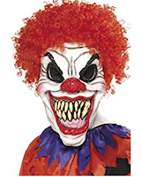
We have decided to use a mask like this, it still appears alarming due to the sharp teeth, long jaw, colours and eyebrow raise. We just feel that using a mask will be more appropriate due to whats been occurring recently worldwide. Katy will be able to remove the mask when needed and put in a bag when walking to and from different locations. We are still going to use the balloon as a prop as it conforms to the idea of the clown and we still want it to look like its luring in children to its evil presence. A lot of filming with the clown will be done on private land, including our gardens as we don't want to scare the public. However, we still want to use parks as they connote to the genre. This is why we are only using a mask as it will be much easier to change Katy's appearance quickly. 

CHANGING CHARACTERS????
Originally, we had three antagonists (Katy the clown and Mae and Chloe the bullies) and one protagonist/vulnerable character (Nadiye the victim). However, we have changed our idea to having one protagonist and all three victims. It will look much more real and interesting not appearing to cliche to the horror genre. We want all three characters to look innocent/vulnerable with one aggressive violent antagonist. 

LOCATIONS???
We are still going to use parks, train tracks and houses for the locations however, we are going to try and use some private land to so we don't have to worry about using the mask and scaring members of the public.

Monday, 24 October 2016

Trailer Titles Analysed-

The title for the film 'IT' is displayed in block capitals with the colour red. The colour red connotes blood, murder, danger and fire. This if effective when demonstrating a murderous clown film as it explains to the audience the type of themes presented and storyline thoughts. The title is 'IT', the short and catchy title is successful when drawing in the audience as it immediately refers to something. The use of 'IT' also describes something unusual and not human as it would be considered rude to address a person as 'IT'. I feel it makes me think of a creature and something not normal. The title refers to the clown which is why it's called 'IT'. I feel its appropriate as it makes the audience wonder what it is and why it works effectively. The title also isn't cliché, it doesn't immediately scream a clown film as it doesn't use the noun 'Clown'. If viewers hadn't heard of the film they wouldn't know it's about a clown or conforming to the horror genre. I like the title 'IT' as it's engaging and catchy, it isn't really long and forgettable. Many trailers you watch you think, "What was it called again?", however, having such a short and meaningful title it will be recognised far more than anything else. 

Another film based around the idea of a murderous clown is 'Amusement'. I feel the name of the film is successful as normal clowns are usually made for entertainment in circuses. However, in horror films clowns are presented as murderous and extremely frightening. The font for the title 'Amusement' looks as if it has been scratched into something, the sharp lines and crosses in the letters imply something sharp and dangerous(Knife/slasher). The black background and black font connotes death, murder, violence and aggression. This is effective when portraying the horror genre as they are all connotations included in a horror film. The title looks like it may have been a board at a circus, luring in people and children to visit the clown, in reality it would be something funny and entertaining, although, in a horror film it would be eerie and frightening. I feel the title is successful as it's short and catchy, it also implies something positive, however, the colours, style and connotations suggest something negative and alarming. 

Another film portraying a clown is 'Poltergeist'. A poltergeist is a ghost or supernatural being responsible for physical disturbances including loud noises and moving objects. The tile is shown in block capitals so it looks engaging and eye catching. The colour white which the shine on the letters also looks appropriate and successful when luring in audiences. The title 'Poltergeist', I feel it is appropriate for this type of film as the noun automatically describes supernatural ideas and mysterious scenes. There are many films and series programmes with similar titles which makes it less original and unique. It also doesn't make you think particularly of a clown as you think more about ghosts and spirits. I also like the title 'Poltergeist' as it explains the type of things included in the film, however, it doesn't immediately make you think of clowns which is why I prefer the other titles. 

Friday, 21 October 2016

Institution Research-


There are many different institutions such as Paramount, Colombian, Walt Disney, Warner Brothers, Lions Gate and 20th Century Fox.

1) Paramount:
Films created by Paramount pictures include Lara Croft, Rugrats Go Wild, School Of Rock, Mean Girls, Titanic, Transformers, Shrek, Indiana Jones, Mission: Impossible, Forest Gump, Iron Man, War of worlds, World War Z, Star Trek, Psycho and many many more.

Paramount is a film studio, television company and motion picture distributer. Ranked as the "Big Six" studio in Hollywood. 2012 was its 100th year in show business. Founded in 1912, it is the fifth oldest surviving film company. One of the most successful film production companies in the world!

The Paramount logo is a Long shot of a mountain with a ring of stars around it. Paramount is presented on top of the mountain in fancy writing. The are nice pinky purple colours which help the institution stand out more. The mountain connotes adventure and explore as they are a cliche for action and thriller film. The twenty-four stars represent the twenty-four contracted movie stars that paramount had at the time.

2)Colombian:

Columbia film productions is an American film production and a studio of 'Sony pictures motion picture group'. One of the largest film productions in the world. Also a member of the "Big Six". Originally founded in 1918 but released its first film in August 1922. At first it was a small production in Hollywood but became much more well known in the late 1920's. 5th largest film production.

Films including The Smurfs, Stuart Little, Spider Man, Ghostbusters, 21 Jump Street, 2012, The Girl With The Dragon Tattoo, Anatomy, Fright Night, Revenge and Murder By Death. The title presents a women holding a flag and torch which signifies The Statue of Liberty. This could be to show power and peace.

3)Walt Disney:

Walt Disney is an American film production company and is owned by The Walt Disney Company.  Also classifies as one of Hollywoods "Big Six" film studios. Founded in 1923, by the man himself Walt Disney. Disney produces a series of short animatic stories which then became huge sensations all over the world.

Disney films are usually made for young children and families, however if you start of watching them as a young child you will always watch the new popular Disney movie.

The Disney movies created include The Little Mermaid, Aladdin,  Finding Nemo, Cars, Maleficent, Mulan, Pirates Of The Caribbean, Monsters Inc, Up, Lilo & Stitch, Alice In Wonderland and the most recent, and hugely popular Frozen.

4)Warner Brothers:
Warner Brothers is an American entertainment company that produces film, television and music. One of the many major film studios whose headquarters is in Burbank, California. Founders= Albert, Harry, Sam and Jack Warner 1903.  First creation in 1927.
Creating super successful films such as the Harry Potter series, Inception, Dark Night, The Hangover and Superman. These films are popular all around the world and are made with a huge budget.
Warner Brothers is the biggest film industry making them the most successful in film business.

5)Lions Gate:
Lions Gate is a Canadian-American entertainment company. Formed on July 3rd 1997 and is headquartered in Santa Monica, California.
From November 2013 it's the most commercially  successful mini major film and television company in North America and seventh most profitable company.
Films including the hugely successful Hunger Games, Saw, Abduction, Kick-Ass, American Psycho and Charlie St. Cloud.


6)20th Century Fox:

20th Century Fox is an American film studio and is one of the six major American film studios, located in Los Angeles west of Beverly Hills.
Founded May 31st 1935 by Joseph M. Schenck and Darryl F. Zanuck.
Distributed some famous films such as first two Star Wars, Ice Age, Diary Of A Wimpy Kid, Maze Runner, Home Alone, Planet Of The Apes, Night At The Museum, Taken, Power Rangers, Die Hard and Avatar.
Member of the Motion Picture Association Of America and celebrated its 80th anniversary as a studio in 2015.

Character Interviews:


Before starting filming, we decided to have some pre recordings of our idea's and interests towards our trailer. By doing this we are able to cooperate with each other and listen to everyone's different concepts.
The first video is of our antagonist Katy, she explains who her character is and what its purposes are. She states "With the intention to hurt them" which demonstrates the horror genre and how the character uses violence and aggression. Her costume will be dark and eerie colours which helps with the mysterious effect. Lastly, she explains that the target audience is appropriate, around our age group as it attracts our types of personalities and interests.  
Myself, the second video also answers the same type of questions. She explains how her character is about to get her "comeuppance" which suggests the antagonist is out to get her and that she becomes the vulnerable frightened character. I tell the audience that I am going to wear "simplistic clothing" to help me look like a normal stereotypical teenager. I state that I like our film genre as horror's are one of my favourite films and i'm looking forward to re creating something with a tense and suspicious atmosphere. 
Nadiye, a protagonist like myself describes herself as a "quiet and shy"character who appears vulnerable and a perfect attraction to a killer clown. She also demonstrates what she will be wearing including "Jeans and a top" as she wants to appear normal and not a threat. Lastly Nadiye tells the audience that she likes how the film relates to our age group and we are able to connect with the ideas thoroughly. 

Planning Targets

For you to achieve your target grade or higher for your research and planning you need to evidence much more in detail planning. You are showcasing your journey towards production and every stage of the journey should be documented.

Trailers which inspired us-

Image result for the film itImage result for clown filmsImage result for clown films
Here are some of the trailers in which inspired us to create a trailer using a clown like figure. The main film which related to our idea is 'IT', we feel it has the most effective scenes and use of MES appropriately.
However, we decided to change many ideas as we didn't want to look as if we were copying Tommy Wallace's film completely. This includes a different use of colour in the outfit, different colour wig and more realistic locations. We got a lot of inspiration from IT requiring the different scenes and story lines. We feel a horror film would work best using a clown when luring in children and demonstrating gore and fright. We really like the idea of using a balloon as the only prop to help show the characteristics but also look appealing to children. Young children would be attracted to the ballon and lean towards it, however, they would be in for a shock when seeing what was holding it. As 'IT' is so popular and well known we thought it would have many different ideas for inspiration enabling us to create a successful product.

The film 'Hello Bingo' was found online. They also use a clown to create the horror film. We got inspiration from the film by using original colours and props. In the film he uses a baseball bat to attack people, however, we would rather use props to lure in characters not scare them immediately. 'Hello Bingo' shows aggressive and violent scenes of attack, however in our trailer we want to make our clown look suspicious, eerie and extremely frightening due to the mise en scene, camera shots, sounds and editing. We feel our product will be most successful by doing this.

The trailer for stitches came across as too amateur and comedic for our ideas and what we want to achieve. However we got different ideas of how we can target children as they are the vulnerable and innocent age group in which we want to portray in our trailer. They also film a lot in at night which helps create a tense atmosphere. We will try and film at night as it conform to the horror genre and will look very appropriate when introducing the clowns presence.

We got a variety of different ideas and inspiration from these trailers as they all have a similar connection to what our trailer intends to be. The use of a clown can appear extremely frightening and mysterious which is why we feel it would be successful for our horror trailer. After researching these trailers our costume, sound, location, lighting etc ideas have become much stronger developed.


Sunday, 16 October 2016

Green Screen...Yes? Or No?

For our trailer, we had the idea of creating a news report scene whereby,  one of our actors would inform the audience of the storyline (Clown). Since Last year we have become much more comfortable when using Adobe Premiere which entitles us to edit our trailer successfully and hopefully produce the best outcome. The green screen would be useful when creating the news report as it would allow us to place different imagery in the background and storylines running along the bottom of the screen. This would make our trailer come across as much more reliable, interesting and tense. 

If we use the green screen, we want to make it look like a news room studio. This will make the audience feel much more on edge as well as looking real and engaging. We will use Adobe Premiere elements as it allows us to play around with different types of backgrounds and get the perfect result. Myself, and others have already had a trial at this editing technique requiring us to use the crop tool, rotate tool, decrease and enlarger tool to get the ideal fit. 

For Mise en scene, the location for a news report is in a studio which is why we edit the background. The dress code is particularly formal which includes suits, ties, dresses and blazers. We thought using our teacher would be effective as he is older, more serious and dressed appropriately. The news is very important as it informs viewers of the events occurring all around the world, this implies it's a very serious subject whereby the presenter must appear authoritative and formal.The correct lighting is also inevitable when editing the background and making the report look real and significant. 
We used a fairly close up shot as we want the actor to stand out among the edited background we place over the green screen. It also appears more serious when its close up as audiences connect with the character more than if he was far away (long shot). 

We planned a script for our actor as we wanted it to be quite 'short and snappy' to emphasise the storyline as well as grab the audience attention.  We wanted to include where the source was from (MET Police), location and the main character in which our trailer is based upon. When recording our actor changed the lines slightly to make it shorter and more sufficient. However, I feel it is successful when drawing in the viewers and explaining the events which occur in our trailer. 

Friday, 7 October 2016

Costume Research-

For costumes, we have mildly decided what we will all wear to make the trailer appear as realistic and representative of the horror genre as possible.


For our clown costume, we have decided to edge away from the stereotypical outfit including the orange, yellow and red tones as we feel it would look too cliche and we don't want to copy our inspirational trailers. We thought the black and white diamond shape costume would work best as the black connotes death, sinister and scare. The red buttons and wig will work well when helping the red balloon stand out. It will also emphasis on the red balloon which we have decided to use in our title. We also want to get a mask, as we feel it will make the appearance look even more scary and hide the identity of our antagonist. I like the black and white costume as it's original and different to the type's of clown films which have come out recently and in the past. For example in 'IT' the clown is wearing a yellow jumpsuit with orange and red frills/buttons. This is too normal and we feel the clown wont appear scary enough in these bright colours. The only prop the clown will have is a balloon to lure in children, we feel a knife or gun would be to cliche and immediately show he wants to kill the victims.

Image result for jeans and a top outfitsFor our protagonist we want her to be dressed in brighter colours ephasising on her innocence and vulnerability. We feel something like the image I have placed on the left would be suitable for her outfit as the lightly coloured jeans and top help subvert from the horror genre and make it overall more exciting. Nadiye is our protagonist, we want her to look unsafe and unprotected enabling the audience to sympathies with her. This will also help as she will be given prevalence, making the audience relate and connect with her the most. Warm bright colours suggest a positive mood and meaning which is effective in a horror film as it questions audiences about the storyline and makes them feel slightly confused. If we were to use cool dull colours the protagonist would look far more negative and scary which is what we want to avoid. Her outfit will immediatly reference her as innocent and the main subject as the other characters are either wearing costumes or dark black colours.

Image result for black outfitFor our two bully characters, we feel a whole black outfit will be the most effective when conforming to the horror genre. The dark colours connote death, murder and misery which is what we want to convey in our trailer. We want the viewers and audience to understand who the bullies are and we feel by using dark colours they will immediately understand. The outfit choice will also look as if they are teaming up with the clown, however, due to the name of the trailer it's not quite what it seems.


Audience And Certificate Research-


Image result for certificate research 15

Every film, whether it's a child's fairy film or a gory horror has a labelled certificate. These certificates include U, PG, 12, 15 and 18. The certificate is there as some scenes aren't suitable for the younger ages as well as having a target audience.
The target audience for our film is a 15, this is due to the story line, plot and characters. We also feel our film will attract this age group as it's not massively scary, violent and aggressive. 

A 15 certificate is aimed at ages 15+, this is due to the types of conventions, story lines and characters which are presented in the film. We believe a clown film would be rated a 15 as we don't intend to use massive amounts of blood and gore. A 15 must not display discriminatory language, however, there may be racist and homophobic themes used throughout the films. There may be drug use, however the film would not promote drugs or show scenes of highly dangerous drug misuse. Scenes including suicide, self-harming and hanging would not be shown in too much detail or effect the viewers. Strong language is permitted, however, depending on the context and person using it. Nudity, and sexual activity will be shown however in little detail. Strong threat and horror will be demonstrated throughout, although, sadistic and sexual threat will not be displayed. Violence may be strong but should not exaggerate on the pain or injury, the strongest gory images are unacceptable and sadistic violence wont be shown. 

Orphan, The Grudge 2 and Scream 4 are all examples of films certificated 15. All the films include fair amounts of gore as well as unnatural possessions. 

Sunday, 2 October 2016

Actors And Props-

For our trailer, we all have an acting role whether it's a main character or someone in the background of scenes.

ACTORS:
Katy- The Clown. We decided that Katy should play The Clown as she was the only one who  volunteered to do so as well as being tall. We want the clown to wear a black and white jumpsuit subverting to the ordinary costume of a clown which includes red, orange and yellow tones. We will also be purchasing a mask to cover Katy's face so it appears far more scary. We chose The Clown idea as we have had many inspirations including the 1990 film 'IT'. We want to put a bit of a spin on it though, this is why we are using different colours for the costume including a mask.
Nadiye- The endangered victim who gets bullied by the two other characters. We chose Nadiye as she is the smallest and most vulnerable. The Clown becomes her friend whereby it gets revenge on the two bullies. We will begin to see Nadiye acting fairly weird and suspicious due to interacting with a 'Psycho' and 'Possessed' character.
Mae(Me)- One of the bullies who targets Nadiye and gets her comeuppance when she comes in contact with The Clown. We chose Mae for the bully as the two main leads had been taken and we needed two characters to portray the bullies. I will be dressed in dark colours to conform to the horror genre.
Chloe- The other bully who targets Nadiye, also getting her comeuppance. We chose Chloe as the two main leads had been taken and we needed two characters to portray the bullies. Chloe will be dressed in dark colours to conform to the horror genre.

PROPS:


The main prop we have for our trailer is the red balloon which is found in the title of our trailer as well as in the clowns hands at all time. We feel this balloon will be successful in positioning the audience to understand the clown is luring in children. It's also something which you see many clowns have and helps make the trailer appear more real. Balloons usually have happy and joyful meanings, however, as its used in our horror trailer it gives a spooky and mysterious effect. I will it will look really successful with the clown as when we are panning the camera and suddenly the clown is there, the balloon will give a much freakier effect.


We may also include a doorbell shot, this will be effective when showing the bullies are home alone and they get a mysterious nock at the door. It will create a tense atmosphere and position the audience to feel slightly uneasy. This isn't completely agreed on yet, although I believe it would be quite successful when portraying the bullies as frightened and overall making the film appear scarier. Many horror films include the unexplainable nock at the door whereby none knows who it is, I feel we could recreate this at our advantage.